What Does an Unprocessed RAW File Look Like?
What does it mean to look at a “straight from camera” RAW photo file? How do RAW processors like Lightroom change the files after they’re loaded, and are RAW files actually images? Those are some questions we’ll be exploring in this article.
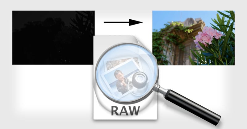
I have a RAW file from my camera, and I’ve used dcraw in a mode which tells it to create an image using literal, unscaled 16-bit values from the file. I converted that to an 8-bit JPEG for sharing, using perceptual gamma (and scaled down for upload). That looks like this:
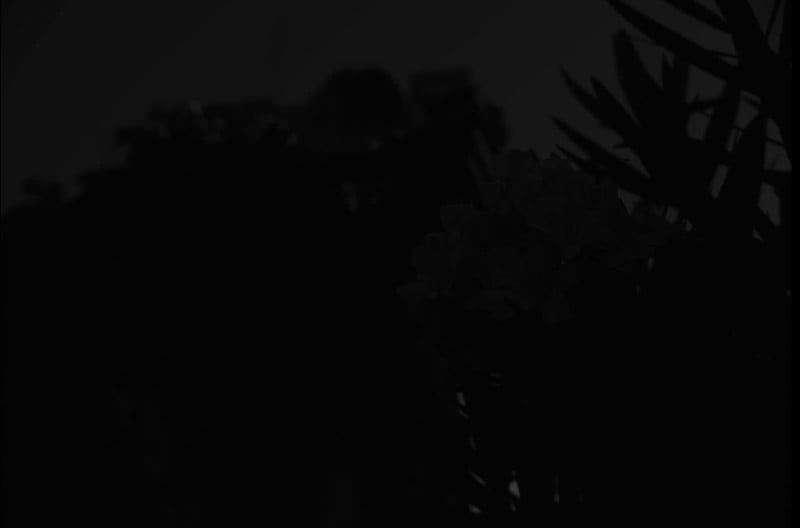
Obviously the result is very dark, although if your monitor is decent, you can see some hint of something.
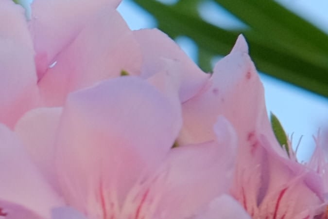
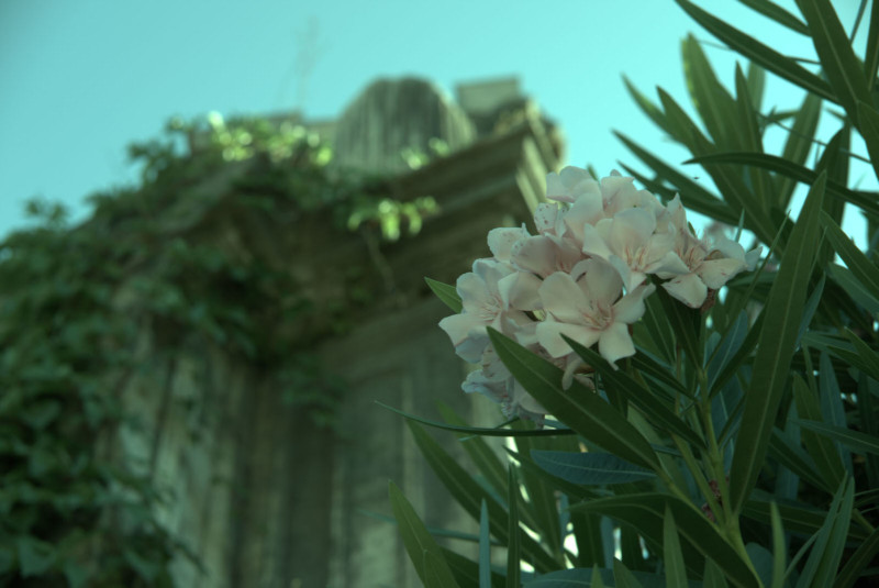
Here is the out-of-camera color JPEG rendered from that same RAW file:
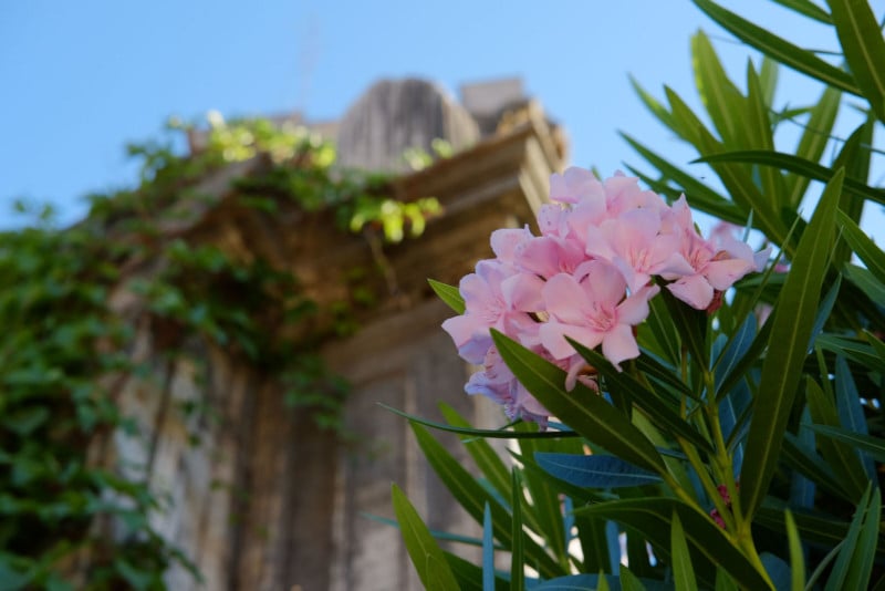
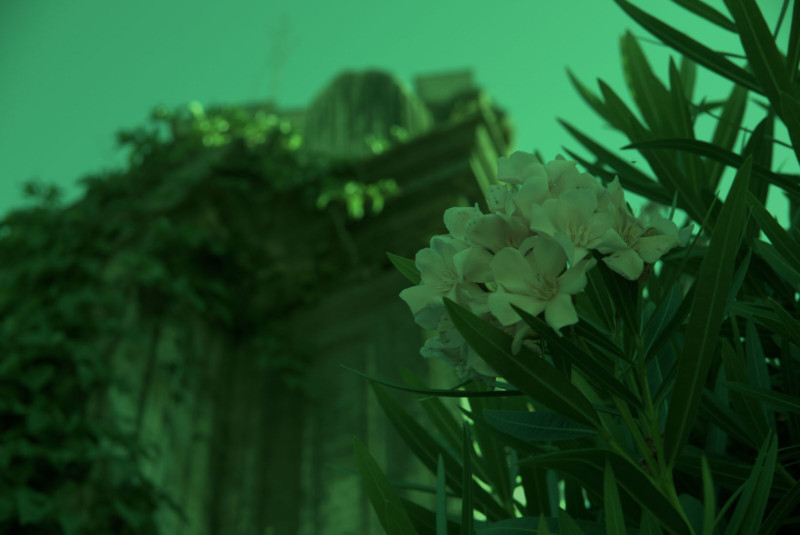
(Photo credit: my daughter using my camera, by the way.)
Not totally dark after all. The details of where exactly all the data is hiding are best covered by an in-depth answer, but in short, we need a curve which expands the data over the range of darks and lights available in an 8-bit JPEG on a typical screen.
Fortunately, the dcraw program has another mode which converts to a more “useful” but still barely-processed image. This adjusts the level of the darkest black and brightest white and rescales the data appropriately. It can also set white balance automatically or from the camera setting recorded in the RAW file, but in this case, I’ve told it not to since we want to examine the least processing possible.
There’s still a one-to-one correspondence between photosites on the sensor and pixels in the output (although again I’ve scaled this down for upload). That looks like this:
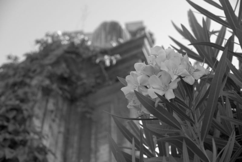
Now, this is obviously more recognizable as an image — but if we zoom in on this (here, so each pixel is actually magnified 10×), we see that it’s all… dotty:
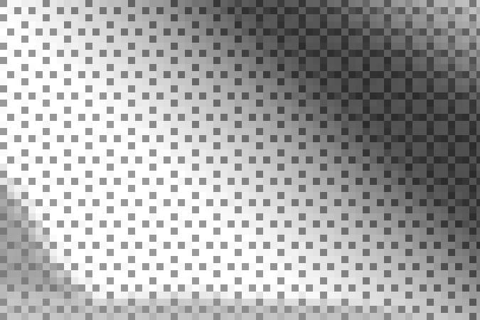
That’s because the sensor is covered by a color filter array — tiny little colored filters the size of each photosite. Because my camera is a Fujifilm camera, this uses a pattern Fujifilm calls “X-Trans”, which looks like this:
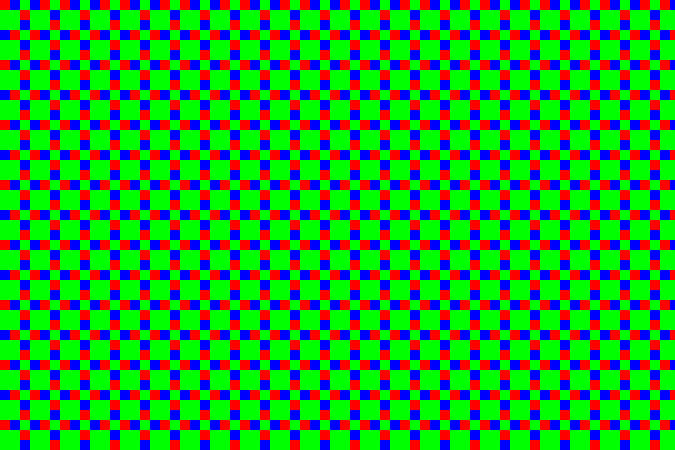
There are some details about the particular pattern that are kind of interesting, but overall it’s not super-important. Most cameras today use something called a Bayer pattern (which repeats every 2×2 rather than 6×6). Both patterns have more green-filter sites than red or blue ones. The human eye is more sensitive to light in that range, and so using more of the pixels for that allows more detail with less noise.
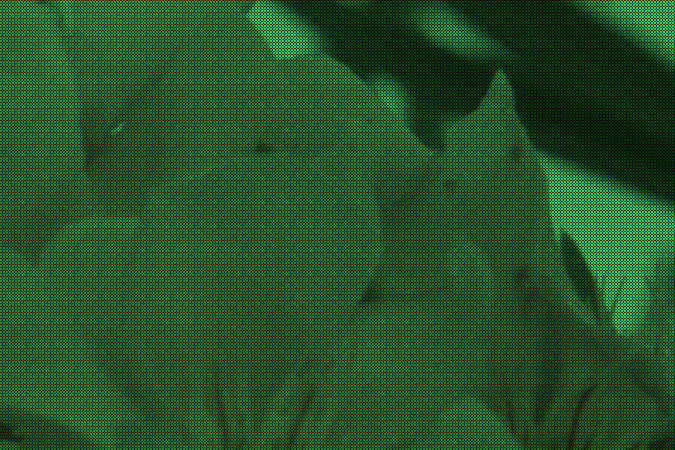
In the example above, the center section is a patch of sky, which is a shade of cyan — in RGB, that’s lots of blue and green without much red. So the dark dots are the red-filter sites — they’re dark because that area doesn’t have as much light in the wavelengths that get through that filter. The diagonal strip across the top right corner is a dark green leaf, so while everything is a little dark you can see the green — the bigger blocks of 2×2 with this sensor pattern — are relatively the brightest in that area.
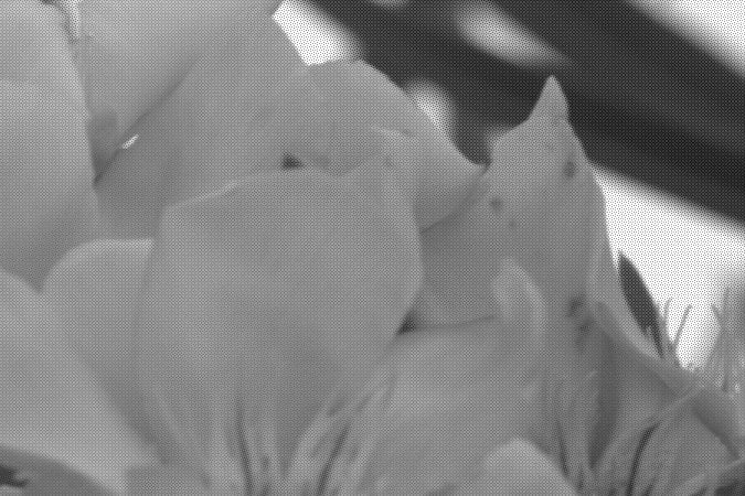
So, anyway, here’s a 1:1 section of the out-of-camera JPEG:
…and here’s the same area from the quick-grayscale conversion above. You can see the stippling from the X-Trans pattern:
We can actually take that and colorize the pixels so those corresponding to green in the array are mapped to levels of green instead of gray, red to red, and blue to blue. That gives us:
…or, for the full image:
The green cast is very apparent, which is no surprise because there are 2½× more green pixels than red or blue). Each 3×3 block has two red pixels, two blue pixels, and five green pixels. To counteract this, I made a very simple scaling program which turns each of those 3×3 blocks into a single pixel. In that pixel, the green channel is the average of the five green pixels, and the red and blue channels the average of the corresponding two red and blue pixels. That gives us:
…which actually isn’t half bad. The white balance is off, but since I intentionally decided to not adjust for that, this is no surprise. Hitting “auto white-balance” in an imaging program compensates for that (as would have letting dcraw set that in the first place):
Detail isn’t great compared to the more sophisticated algorithms used in cameras and RAW processing programs, but clearly the basics are there. Better approaches create full-color images by weighting the different values around each pixel rather than going by big blocks. Since color usually changes gradually in photographs, this works pretty well and produces images where the image is full color without reducing the pixel dimensions. There are also clever tricks to reduce edge artifacts, noise, and other problems. This process is called “demosaicing” because the pattern of colored filters looks like a tile mosaic.
I suppose this view (where I didn’t really make any decisions, and the program didn’t do anything automatically smart) could have been defined as the “standard default appearance” of RAW file, thus ending many internet arguments. But, there is no such standard — there’s no such rule that this particular “naïve” interpretation is special.
And, this isn’t the only possible starting point. All real-world RAW processing programs have their own ideas of a basic default state to apply to a fresh RAW file on load. They’ve got to do something (otherwise we’d have that dark, useless thing at the top of this post), and usually they do something smarter than my simple manual conversion, which makes sense because that gets you better results anyway.
About the author: Matthew Miller is an amateur photographer and open source software enthusiast based out of Massachusetts. The opinions expressed in this article are solely those of the author. You can find out more about him through his website. This article was originally published here.