Infinite Color: I Created a Smart Color Grading Tool for Photoshop
Working as a retoucher, one of the hardest parts of my job wasn’t even the cleanup work that an image typically requires, it was the color grading. Applying a specific look to an image to really enhance or create a mood that meets the client’s vision was either doable or really hard. There was never a time when it was completely easy, even for me.

People always know what they don’t want, but figuring out what they like is the hard part. With the sheer amount of possible color variations that an image could lead to, the choices are almost infinite! And in that moment of realization, I came the idea for Infinite Color. It was born out of necessity for me. I was curious to see what it could do to my life and to others.
What if there was something that allowed you to see an infinite amount of ways you could color grade an image? It almost sounded like a superpower in Infinity War. However, that might be the worst superpower ever in a fight! But for a photographer or a retoucher, it’s a good power to have!
This would open up a level of color communication with yourself and your client. For instance, it would give you an idea of the possible direction you might want to go in without doing a lot of work when you see the color potential of your work. Then, you could easily navigate it towards the final destination.
In relation to clients, I had someone who told me that they used it on set when the client wanted something “edgy” and had no other references. He told them to give ICP a spin and then suddenly the client found something they liked within a few tries. It was a done deal and the process of communication was much easier.

Even within your own personal work, if you’re curious to see which path the image could go, this opens up an opportunity to explore that. I’ve opened up old work just to see what it could look like and if I had missed any potential paths with color. Maybe you don’t want to use what it provides, but you like the idea of what it created, this gives you that clarity of direction and the ability to modify it to suit your taste.
Suddenly I realized I solved a huge part of my frustration as a retoucher. I initially developed this for myself but wanted to make it available to everyone to try.
How It Works
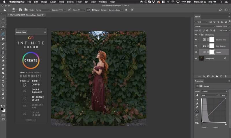
Here’s a video I made about what it is (within the first two minutes) and how it actually works. There’s even a way to save all your layers at the end of the video that allows you to make your own “presets” and apply it to a series of images for consistency! Every feature is explained in the video.
The Best Features
The video goes over everything on how the panel itself works and the features. There are a few key features which are my favorite that I see people really liking. Be sure to check out the video so these points make more sense.
1. Harmonize
We decided to keep harmonize a feature that picks the highlight color of the image, and then creates a triadic color scheme from that base color. You can then override the colors to your choosing. This tool was originally not going to be included but we decided to do so as a bonus. We also tried to have it so anyone could pick which color they wanted as the primary color but surprisingly the results weren’t as pleasing. Doing it in the way that it is structured in now gave a good recommendation as a starting point, and allows for complete flexibility for adjustment. Since the regions and layers are set up for you, you can modify it on your own. This became the most optimal layout for the feature based on how it starts off and a level of customization.
2. Flexibility of layers
Some people want to only randomize a certain set of adjustment layers rather than all 5, so you can turn on only the ones you want. Also, it was important that we built in the ability to shuffle individual layers without altering the rest of the layer stack once it was generated. You can then tweak the settings of each layer as well.
3. Intensity
What made this panel possible was the functionality of intensities. Images with a lot more shadows require more subtle adjustments, so adding three levels of control from light to intense really helped keep the same balance across a wide range of images. The intense feature works better with brighter images with a lot more highlights, and the light setting works best with darker images like the one in the video.
4. Scripted by referencing actual high-end layer stacks
When we had first started out building the panel, it started out really bad! The colors were all over the place because reality didn’t match theory. Truly randomizing layers produced bad results. I had to sit down and dissect what made beautiful color toning so beautiful. So I took 100’s of my old PSD files and referenced what I had done for certain editorials in different lighting conditions. I saw patterns in how far or restrained my settings were for each adjustment layer. With that in mind, we scripted it so it was within those parameters in each intensity setting. Suddenly, the way it all interacted together was like magic and we finally found something we loved.
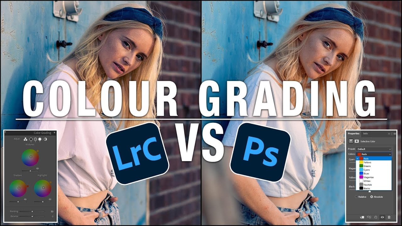
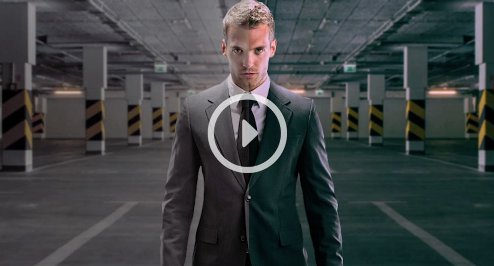
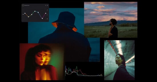
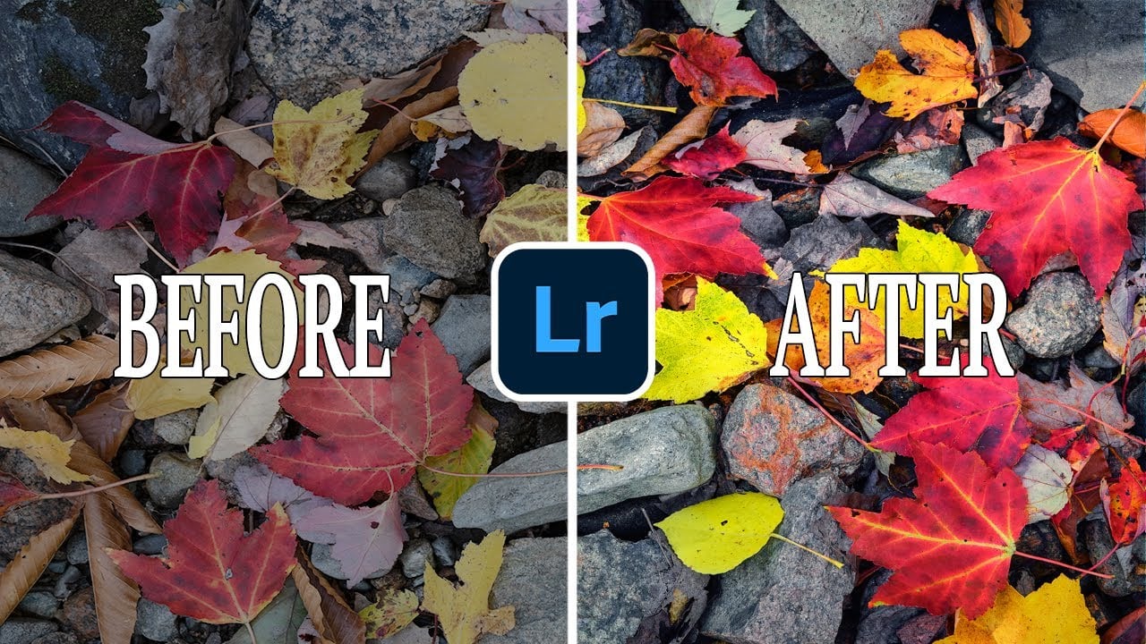
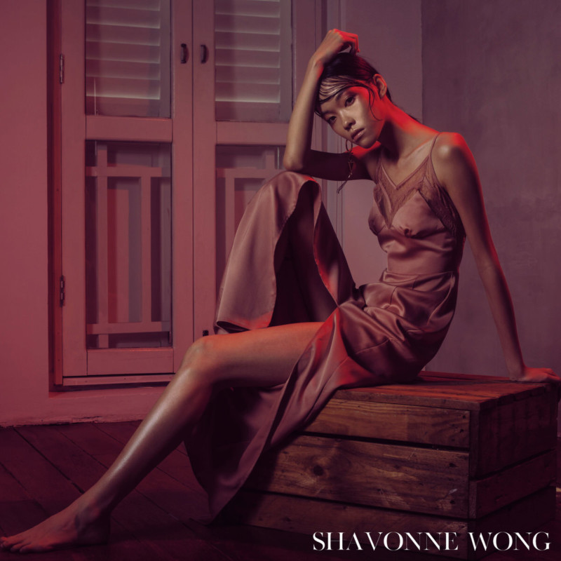
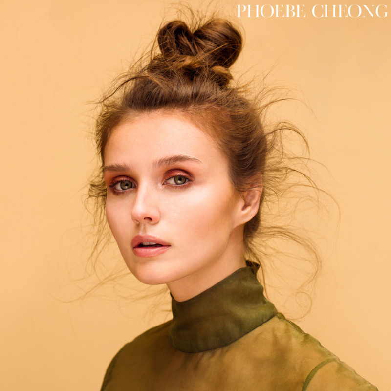
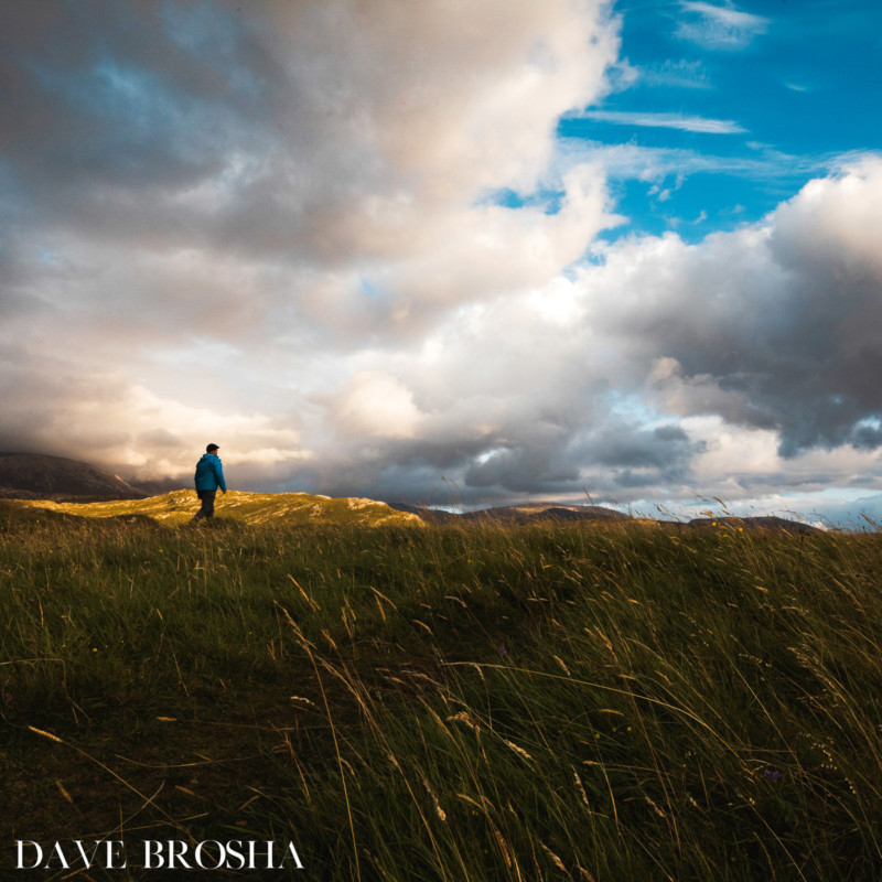
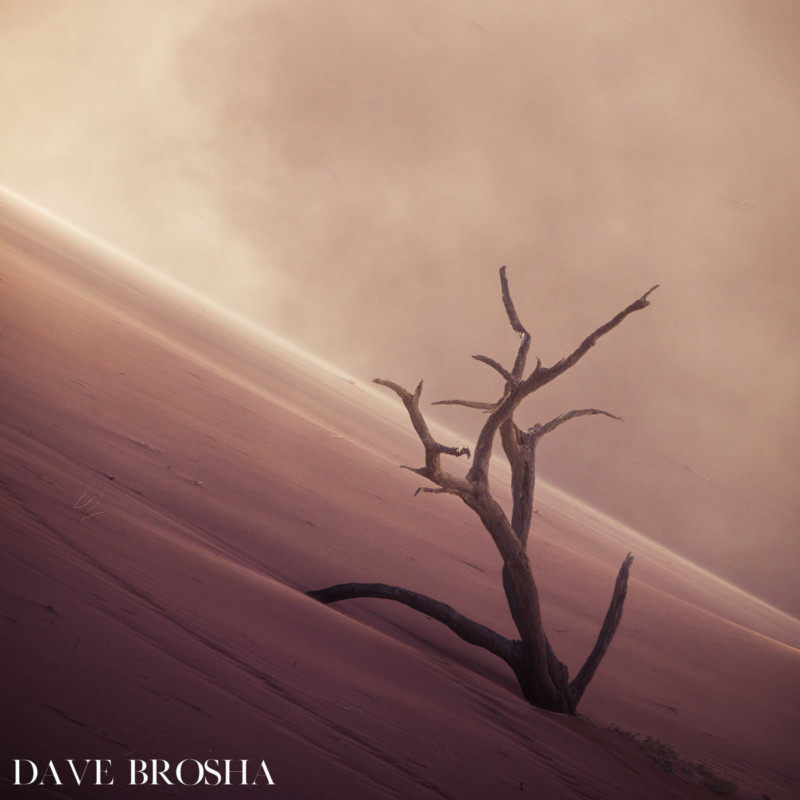
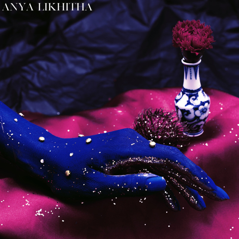
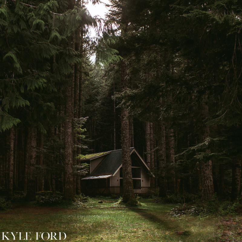
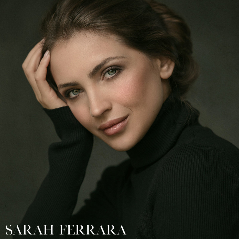
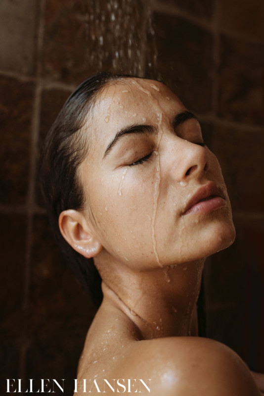
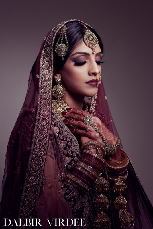
The photos in this article were all color graded using Infinite Color. Here are some more:
Infinite Color currently has a discounted opening price of $99, down from its standard cost of $129. You can also find before-and-after comparisons, testimonials, and more photos from the community on the panel’s website.