How to Use Victorian Composition Ideas in Your Photography
This is a set of notes on composition, loosely based on ideas of composition from the Victorian era. There’s quite a bit more, and yet quite a bit less, to the Victorian ideas.
There are endless systems involving drawing lines all over the frame, and tips, and tricks, and one-off ideas. To the extent that any of these are useful, they are merely helping you think consciously about things which you normally perceive, mostly, unconsciously. All systems, tips, and tricks are un-useful to the extent that they promote sameness, compliance to norms.
Ultimately, all pictures are different. Every aspect of a picture interacts simultaneously with every other aspect to produce the total sensation of looking at the thing. All we can really hope to do is to be conscious of some reasonably useful subset of the kinds of things that might happen, as we construct the picture. Then, as we build it, we can weigh and evaluate some important aspects of the picture — consciously — and have some reasonable chance at succeeding in whatever goal we’re shooting for.
This article is therefore aimed at describing a useful “kit” of formal, graphical, aspects you can be aware of as you shoot.
Composition
Composition is the process of placing masses, lines, and points of tone and color into the frame. For the photographer, often, many of these masses, lines, and points are actual things. Not all of them are, however. A line might be an edge between two things. A line might be implied, by perhaps the direction of a person’s gaze, two similar objects with more or less blank space between might imply a line connecting them, and so on.
First, some high level concepts which you can keep in mind. These are, roughly, the big three from Victorian composition. There are others, “breadth”, “harmony” and whatnot, but these are three important ones that are easy to get your arms around, and which you can hold in mind as you work.
Balance is the feeling that there’s enough of everything, properly distributed in the frame. The frame does not feel like there’s too many things, or too much darkness, or too many mice, on one side of the frame and not enough on the other. We could be talking about objects, colors, lines, textures, anything. And we should be thinking about all these things as we compose.
Unity is the degree to which the frame hangs together as a single coherent idea. A bunch of elephants, all over the frame? Unity. Elephants on one side and paint cans on the other? Less unity. (Also, that frame might be unbalanced.)
Variety is the degree to which things are “going on”, the of amount different stuff (again, objects, colors, lines, textures, anything) in the frame. Variety makes things interesting to look at, variety can also make things confusing, hectic. Variety can contend with unity, a frame with a great deal of variety will (probably) tend to have less unity.
Unity and Variety are almost opposites, but not quite. The Victorian ideal was a balanced frame, in all ways, with enough variety to be interesting and unity in balance with that to pull the frame together as a coherent whole. It’s the 21st century, and this need not be our goal today, but the underlying concepts still provide a useful way to think about pictures.
Onwards from these high-level ideas to some concrete formal/graphical elements. These are really examples of actual things which can occur in your picture, and we’ll discuss a bit ways in which they may tend to create or destroy balance, unity, or variety as well as other features. None of this is cast in bronze, it all depends on the exact picture you’re making. The point is to have these things in mind as you shoot.
Line
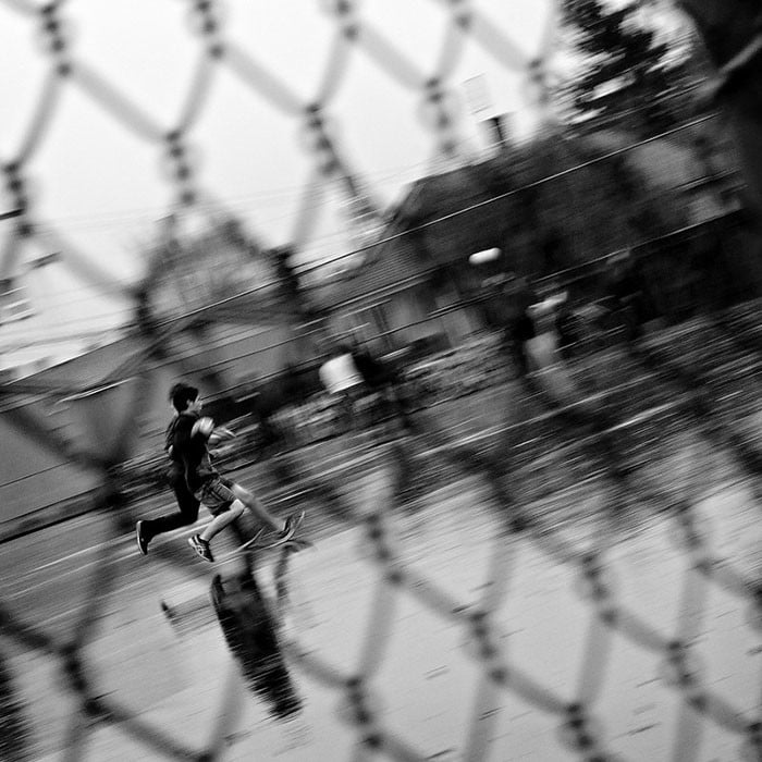
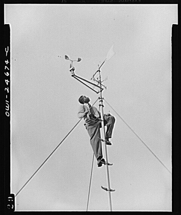
Most “systems” of composition boil down to “diagonal lines good”. There is a sense of dynamism to the diagonal line, be is a real line, or the implied line connecting two objects. This is why a reasonable default is to simply organize the picture along a diagonal, this will usually impart a little drama, a little “motion” or tension or interest to the picture that a horizontal or vertical organization often won’t. This can mean either placing important masses along a diagonal, or aligning an important actual line in the frame with the frame’s diagonal.
Horizontal and vertical lines are also things that may or may not have an effect. It is not that “horizontal lines create a sense of rest” or whatever the system-composition guys want to say. The point is that you should be aware of the lines in your picture, the one you’re making right now and you should have some sense of what they’re doing to your picture.
Line can balance against line. Two opposing diagonals might create a triangle and feel “stable” whatever that even means. A group of horizontal lines might be balanced visually by a group of vertical lines. Lines of varying orientations can create variety. Parallel lines might create unity. And so on.


So, as you shoot, look at the actual and implied lines in your picture. It’s about being conscious of the lines as you shoot, rather than unconsciously feeling their effect too late. Look at the lines, be conscious of them as you shoot. Ask yourself “do these lines create unity in my picture?” and you will know the answer, immediately, because you’re a person and you feel things like a person does. The magic is in knowing to ask the question, and a bunch of other similar ones.
Tone and Chiaroscuro
The Victorian treatment of tone frequently involved a gradation of tone from line to dark, frequently on a diagonal. Dark in the upper right, grading to light in the lower left, for example. Then, you introduce variety by placing small regions of light into the dark areas, and vice versa.
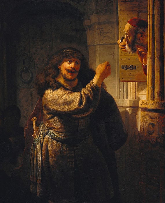
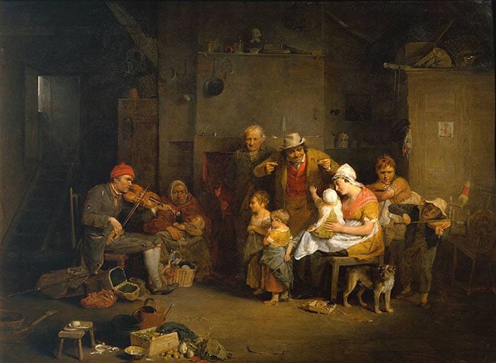
Think of any Rembrandt portrait, and you’ll see it instantly. (Rembrandt predates the Victorian era by a lot, but these ideas are formalized and dominant in the Victorian era.) By echoing similar shapes in your small regions of light and dark, or by placing them in balancing ways, you can introduce unity. The gradation from light to dark along a strong implied diagonal can also pull the picture together.
Commonly, you’ll find a single dominant bright spot. This might be the sun or particularly bright cloud in a landscape, a white hat in a street photograph, that sort of thing. The single bright spot can form a sort of center around which the picture wraps itself. A small bright region, or better yet a small bright region adjacent to a small dark region, tends to be instantly interesting.

Burning and dodging are your friend, here, to manage all these tonal relationships. You can do a tremendous amount in post here, see for instance every single picture Ansel Adams printed. Interestingly, once you have this bag of tools in hand and you look carefully at Adams’ landscapes, you will see the enormous debt he owes to traditional painting and Pictorialist photography.
It is in these ideas that we find the notion of tonally separating the subject from the background, as well. We’re not really discussing subject here, but clarifying the subject is part of the job of composition, and Tone is normally the tool used. However, see also color.
Color and Saturation
Color can work a lot like tone. It’s more subtle, but it can be operated in something of the same ways. Differences and commonalities in hue and saturation can support or compete with differences in value (tone). Similar hues tend to pull the picture together (unity). Different hues tend to create variety.
Complementary colors, colors opposite one another on the color wheel, interestingly tend to lean toward unity as well. I don’t know if this is cultural or embedded in our visual cortex, but it doesn’t matter.
Degree of saturation can behave something like tone. Selectively adjusting saturation is something rarely discussed, but once you start looking around you see it all over the place. That one pop of saturated whatever stands out and acts as the single dominant light, the strong center the picture can arrange itself around. A palette of two colors, complementary on the color wheel, creates unity through the complementary nature, and gives a little variety because it is after all two colors.

A huge percentage of fashion photography is built around these two ideas. Look at pretty much any color fashion photograph, and you will find two complementary color palettes extremely dominant, to the extent that finding even a small patch of color that’s out-of-palette is difficult to impossible. Saturation adjustments are usually easy to spot if you’re looking for them, either adjustments to pull things together (unity) or pops of saturation to point out what to look at, or both.
Space and Grouping
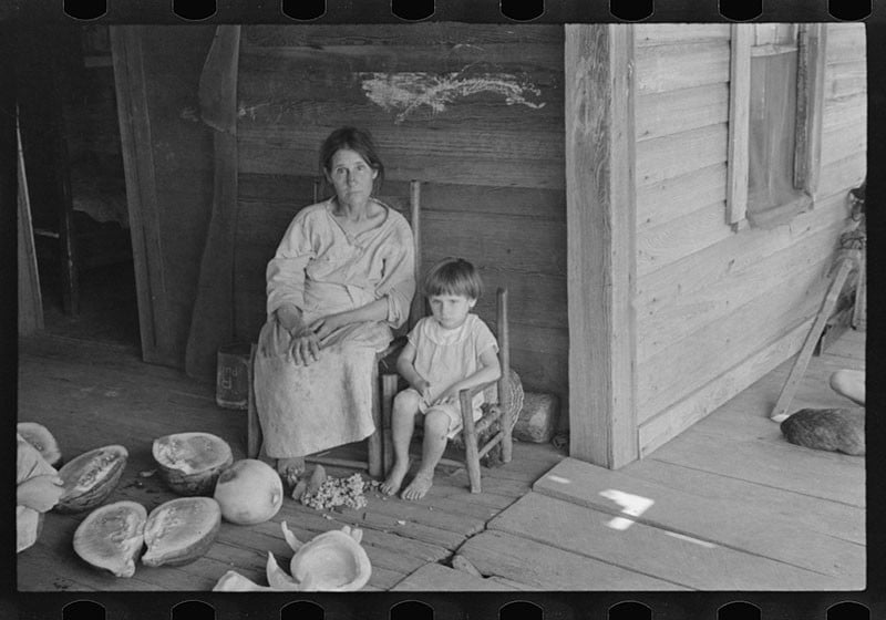
If you have two obvious masses in the frame, be they objects or merely masses of tone and color, the implied line which connects them will more or less pop out. Often, people organize on the diagonal. With more objects, they may fall into a triangle, a square, or some sort of amorphous blob.
Traditional victorian composition often grouped things into triangles, base-down. Indeed, they sometimes used overlapping collections of triangles building themselves into bigger ones. These created a certain bottom-weight which made the whole thing pretty satisfying. The other really common Victorian structure was an oval shape, with the masses and objects arranged roughly in a circle or ellipse which creates a sort of stable little bubble-world. Not as massy and bottom-heavy and the triangles, but stable and balanced nonetheless. It doesn’t want to “stand up” but it is at rest.
Pushing forms into well defined shapes tends to generate unity. Things which break the pattern generate variety. Note that it’s possible to be part of a larger pattern while breaking a smaller one. The forms in the frame can be themselves balanced or not, but also the larger shapes implied by the positions of forms can themselves be balanced, or not.
As always, the message I wish to communicate is to be conscious of the implied lines, to be conscious of the shapes of these larger implied “masses” as you shoot.
The ideal Victorian picture is roughly as follows. One corner is quite dark, the opposite quite light, with a transition of tone between them along the diagonal, creating a mild dynamic thrust. This creates balance by weighting the light against the dark around the center, as well as variety because it is light versus dark.
In the dark portions of the frame we find small regions of light, and in the light portions, small regions of dark. These small regions create variety, and by echoing one another in size and shape more or less diagonally across the frame, they enhance unity. The important graphical masses are arranged in a larger form, usually one of more triangular or pyramidal shapes, less frequently in a circle or oval, creating more unity, more coherence. There is a single dominant light region, small and rendered more visually important by placing it against a dark area for greater contrast.
Once you have this template in mind you’ll start seeing it everywhere from Rembrandt to Adams and everywhere in between. Not every well known painting or photograph will have all these features, but most of them will have several of these features.
As a final concluding remark I will note that the same ideas of balance, unity, and variety apply beautifully to the construction of portfolios, books, and so on. These same ideas can be used to understand how any grouping of photographs functions (or does not) as a group. These ideas are as incomplete here as they are when dealing with composition, but still provide a useful toolkit.
About the author: Andrew Molitor writes software by day and take pictures by night. He’s based in Norfolk, Virginia, and does his best to obsess over gear, specs, or sharpness. You can find more of his writing on his blog. This article was also published here.