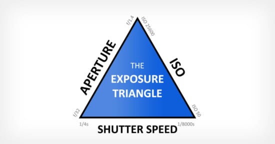
The Exposure Triangle Sucks, Here’s Why
“The Exposure Triangle” is a catchy phrase meant to encompass the three factors which affect the exposure of a photograph of a scene with a given amount of light. It’s often given to new photographers as a learning aid.
I’m not sure if he invented it, but it is certainly popularized by Bryan Peterson, as in his book Understanding Exposure. (The popular web site Steve’s Digicams gives Peterson credit for the term, as do other authors).
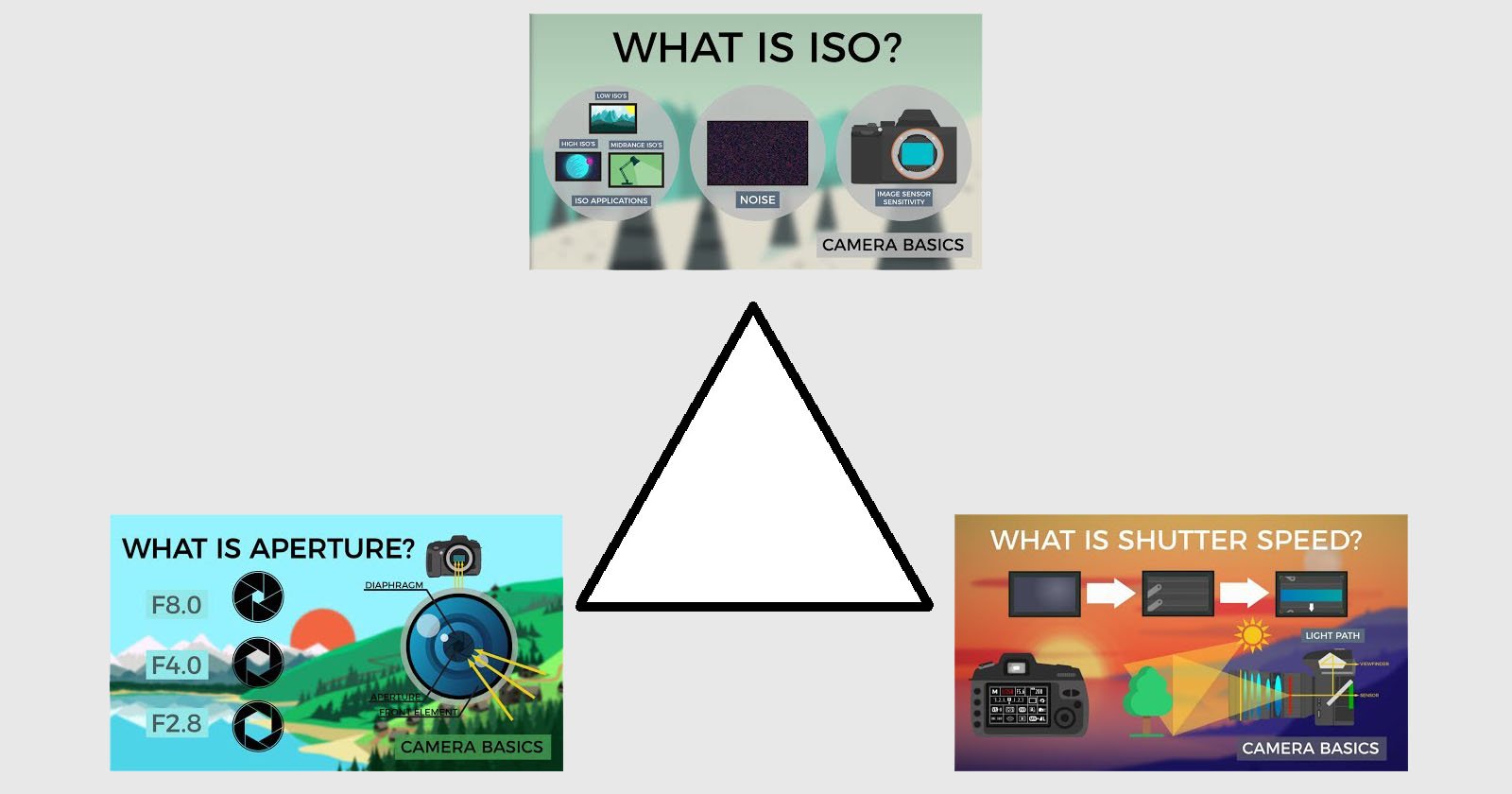
The three factors are:
- Shutter — how long you let light in
- Aperture — how large of an opening you let light through (how much at once)
- ISO — how sensitive your film or sensor is to light
Each factor is interchangeable in terms of exposure, so that a decrease or increase in one factor must be met by the same amount of change in another. (More on this below!) And each has intrinsic secondary effects on your composition—longer and shorter shutter speeds freeze or blur motion, smaller apertures give more depth of focus, and generally higher ISO causes more noise as one attempts to get more signal out of less light.
The problem with the phrase “exposure triangle” is that the relationship between these three factors does not actually share any of the properties of a triangle other than “threeness”. That makes it a bad analogy, which can introduce more confusion than necessary, as new photographers attempt to reason from the information they’ve learned.
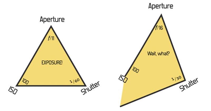
Let’s say we have a triangle where the sides (or corners—it doesn’t matter) represent a shutter speed of ¹/₆₀th, aperture of f/11, and ISO 100. We draw a triangle, and we label that “Properly Exposed for EV 13”. (See the Wikipedia article on EV for where the value “13” comes from). So far, so good—we’ve got our triangle.
Now, what if we want to change the shutter speed to ¹⁄₃₀th, and the aperture to f/16? That should give the same exposure. But what happens to our triangle? Do we double the size of one line, and halve the other? Or is there some other relationship that’s meaningful?
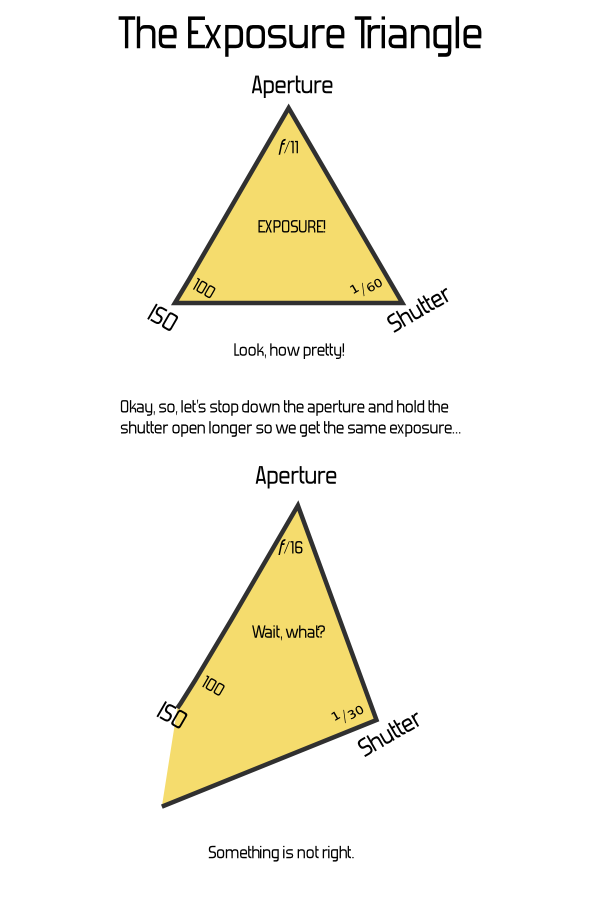
It doesn’t take much mucking about with a pencil and paper to determine that, no, this just breaks down. If you attach any actual meaning to the dimensions of the sides or the angles of the corners, not only is there no relationship to the area or size of the triangle, many settings yield impossible triangles even though they’re perfectly valid exposure settings.
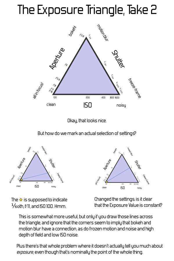
An alternate approach would be to leave the triangle’s geometry constant, and put labels along the sides. This is somewhat more useful for thinking about the non-exposure effects of the parameters, but fails on actually showing anything about exposure. (And worse, may cause confusion by implying a linkage between the factors where they come together at the corners—how does bokeh connect with motion blur?)
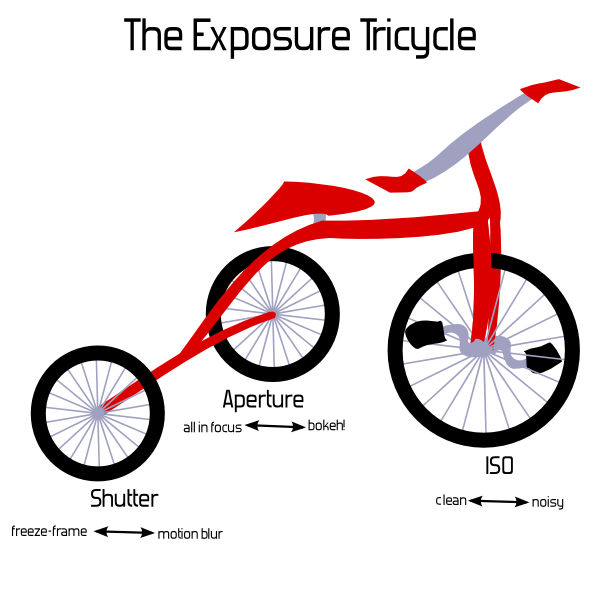
Basically, it’d be just as useful to say The Exposure Clover, or The Exposure Tricycle, or the The Exposure Set of Juggling Balls. Or the Exposure Branches of the U.S. Government, although that may be harder to draw in an intro-to-photography book. I humbly submit the following illustration for anyone’s use; I’ll leave the other suggestions as an exercise.
(But I’m not ending with unhelpful sarcasm, I promise. Keep reading below.)
I’m joking, but I’m also serious: there’s nothing particularly useful about the triangle for explaining these factors, and in fact it might be detrimental. So, we might as well use something funny, if the only point is to be memorable and associated with the number three.
If you’re not fond of math and details, you can stop right here. Just remember:
- There are three exposure factors you can change on your camera, assuming fixed lighting in the scene.
- If you want to darken or lighten the resulting image, you can change any one of the three (up until the inherent limits of each factor). For example, if you want to brighten an image taken at ISO 400, f/8, and shutter speed ¹⁄₁₂₀th of a second by one stop, you could change any one factor: ISO to 800, aperture to f/5.6, or shutter to ¹⁄₆₀th. (If you change all three, that’d make a three stop change, of course.)
- If you want to keep the exposure the same but change a factor, you can change either of the other two factors in the opposite direction. So, for the example of ISO 400, f/8, ¹⁄₁₂₀th, if you wanted to freeze motion better with a shutter of ¹⁄₂₄₀th, you could keep the exposure the same by changing either ISO to 800 or aperture to f/5.6.
Or, (if you are interested in thinking of this geometrically) we can use a better representation: The Exposure Cuboid—a rectangular box. That sounds nerdier and not nearly as catchy, but it has the advantage of actually being useful. Each dimension—width, length, height—corresponds to one of the exposure factors, and the volume of the box corresponds to the the exposure.
This works out exactly right. Each of the three settings can be adjusted independently, and a doubling of any of them doubles the overall exposure—or cutting one in half cuts the overall exposure by half. This is just the same way that changing the length of one of the sides of a box changes its volume. So, we get both a visual analogy and an accurate mathematical representation.
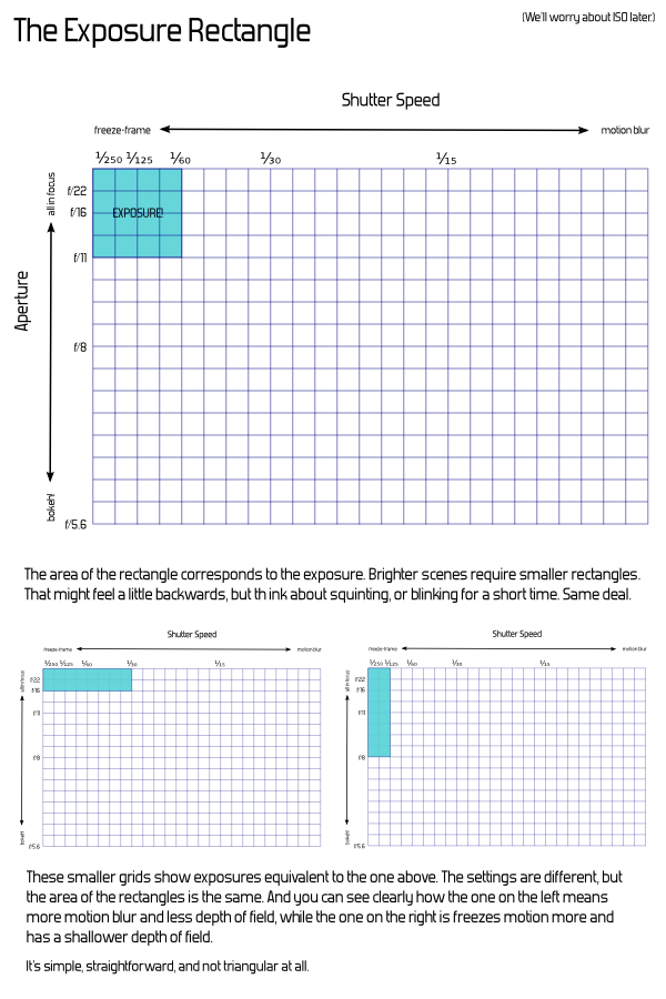
And it’s nice from a simplicity point of view, because we can start by leaving off one of the dimensions. If one were using this as a tool to actually explain exposure, we’d start with shutter speed and aperture alone—that’s a (plain old regular two-dimensional) rectangle. The Exposure Rectangle still isn’t quite as catchy as triangle, but at least everyone knows what a rectangle is, too.
Take some graph paper, and mark off shutter speeds along one side. Start at, say, ¹⁄₂₅₀th at the first mark, then double that time to ¹⁄₁₂₅th at the second mark, and then ¹⁄₆₀th at the fourth mark, and ¹⁄₃₀th at the eighth, ¹⁄₁₅th at the sixteenth, and so on. Actual doubling of time is directly represented by actual doubling of space. We’ll get to the concept of “stops” in a bit. (And you’ll notice that the number sequence I’m using isn’t exactly doubling—for whatever analog-days reason, this is the standard sequence and it isn’t exactly precise. That’s another chapter, really—at this point, just consider it rounded-off and close enough.)
Along the other axis, we’ll mark apertures. Start at the first mark with something small, like f/22. Then, follow the standard sequence of aperture values from there, again making sure to double for each rather than just marking each square—so, f/16 at the second mark, f/11 at the fourth, f/8 at the eighth, f/5.6 at the sixteenth, and so on.
Now, you can directly visualize the effect of increasing or decreasing one of the factors. The exposure of the scene is the area. Any combination of aperture and shutter speed which gives a rectangle of the same area will give the same exposure. Doubling the shutter speed actually doubles the exposure, just as one would expect.
If you draw a rectangle with one corner at the origin and going out to ¹/₆₀th and f/11, with the labels as above, you get a 4×4 rectangle—area 16. (Here, the actual number 16 is just an artifact of how we decided to start our labeling and the size of the squares—the actual number is meaningless.) Change to ¹⁄₃₀th and f/16, and it’s 8×2, or ¹⁄₁₂₅th and f/8 for 2×8—either way, still the same area.
And adding in the third factor, ISO, is simply extending this to the third dimension. This is harder to draw on paper or put in a book, but once you have the idea of the rectangle down, it’s not a far leap conceptually. Imagine an ISO axis extending upward out from your page, labeled similarly to the others. The exposure value becomes the volume of the cuboid, and pretty much everything works the same way.
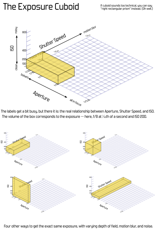
Another convenience is that shutter-priority or aperture-priority modes can be visualized as flat rectangles within the 3D box. Turn it so whatever two values are adjustable are conveniently aligned.
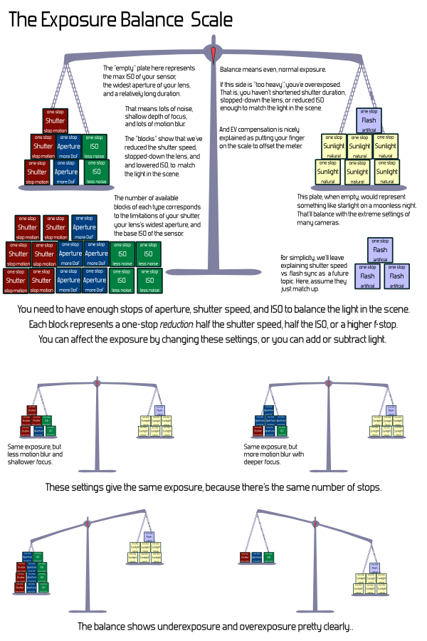
But a problem with this is that the paper—or cuboid—gets big pretty quickly. And those big areas get cumbersome to work with. That’s where the concept of “stops” comes in. Rather than working with linear labels and area, we can work in a logarithmic space based on powers of two. That might sound intimidating, but it simply means that we count the number of doublings, rather than using the direct numbers.
Again, sounds like I’m using too many big words, but the great thing is that counting is easy. In fact, you don’t even have to count—every modern camera has a meter which “weighs” these things automatically and tells you how many stops you are off. Just like a balance scale.
That loses out on the concept of “threeness” entirely, and it feels a bit unnatural to add things to darken exposure. Someone spending a lot of time thinking about which direction is up isn’t really learning the important part. It also doesn’t cover flash duration properly. And I sure did end up putting way too much explanatory text there. That’s problematic for an introductory diagram (although I’m sure with some work it could be cleaner).
Anyway, the point is: it’s catchy to say “triangle”, and since there’s three factors, it seems obviously true, garnering automatic nods from people who are familiar with the concepts already. And for many people it’s pretty harmless. However, there’s a more useful geometric explanation which can actually be used to show how the factors really relate. The cuboid may feel like jumping in the deep end, but the rectangle shouldn’t be too intimidating, and going on to the third dimension is a natural progression in the lesson.
If that seems too complicated, why bother with a geometric analogy at all? I know that in the last few years it’s become a common idea and Peterson’s books are very popular. I know many people even find it helpful. I’m not really on a Quixotic crusade to make sure every use of “the exposure triangle” is actively stomped out—but I do recommend against introducing it to new users. Putting the three factors in a bullet-point list works just fine, and doesn’t add any inadvertent confusion. Or you can stick with the tricycle.
About the author: Matthew Miller is a computer scientist and amateur photographer based out of Massachusetts. You can find out more about him through his website. This article was originally published here.