colors

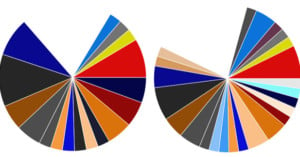
Graphing the Dominant Colors in Photos of Europe

A friend (Eric) and I were hanging out one Sunday and we decided to do something fun with EyeEm data. We obtained and then graphed the predominant photo colours for every photo uploaded or tagged in Europe. We then generated these pretty pie graphs for each country.

Quick and Dirty Explanation of Color Depth: What It is and Why You Should Care

Whether it's photography or video quality we're talking about, the discussion almost always revolves around some aspect of resolution. The number of megapixels, or the pixel density, or the pixel size (last one doesn't necessarily have anything to do with resolution, but you get the gist).

One spec that doesn't get a lot of headline time is color depth, and so we were thrilled when we stumbled across this quick and straight-forward explanation of what exactly color depth is by Techquickie.

Fascinating Book Described Thousands of Colors 271 Years Before Pantone

The incredibly comprehensive (and occasionally inspirational) Pantone Color Guide made its debut in 1963, but 271 years before Pantone began mixing 11 colors to match thousands of others, a Dutch author was busy mixing watercolors and creating a fascinating 700+ page guide entirely by hand.

Tutorial: A Simple Technique for Matching Tones and Correcting Colors in Photoshop

One of the issues talented photographer and retoucher Michael Woloszynowicz often runs into when he's taking portraits is mismatched skin tones. Using a light modifier of some sort he'll get the tone he wants in the face, but the tones or colors in another part of the subject's skin simply don't match.

You could correct for this using curves, selective color or hue/saturation, but Woloszynowicz has a better way: using solid fill layers and tonal averaging, he's able to "take the guesswork" out of it and perfectly match tones every time.

Photo Series Illustrates Crayon Colors by Using the Objects They’re Named After

Crayola Crayons -- the tools with which many a toddler has decorated many a refrigerator door -- all have interesting real-world names. Some strange colors like 'Flesh' have been understandably renamed. But many equally interesting colors have remained staples in the coloring world, and it's these colors that photographer Daniel Seung Lee and art director Dawn Kim set out to capture in their collaborative series Crayola Theory.

Exploring the World of Color Theory with a 3D Modeling Program

From time to time I post plots of color gamuts like the one above. Each time, I get emails asking how I make them, leading me to assume that the world's thirst for color nerdiness is going unquenched. I'm setting out to fix that in this post.

Abstract Long-Exposure Photographs of Colored Paper in a Cave

Los Angeles-based photographer Brice Bischoff has a project titled Bronson Caves. Between 2009 and 2010, Bischoff visited the caves in Los Angeles' Griffith Park with his 4x5 large format camera and some very large sheets of colored paper. He then used long exposure times to paint colorful blurs into the photographs by waving the papers around.

BTS: Shooting Portraits of Models Being Hit with Colorful Powder

Photographer Philippe Echaroux tells us that he recently completed a photo shoot for a series he calls, "The Pigment Party". Echaroux's idea was to capture studio-lit portraits of models posing serenely amidst explosions of colorful powders. After covering the studio with tarps, hanging up a black backdrop, and setting up his lighting, Echaroux had his assistants toss pigment powders of various colors onto the model's face.

The behind-the-scenes video above offers a look at how it all went down.

A Photographic Study of One Tree Over Many Years and Seasons

Last week we shared a project by photographer Tyler Casson that featured four photos of an island across four seasons of a year. Photographer Kevin Day has been doing a similar project -- one that he has been working on for over five years now. The Berkshire, UK-based photographer has been visiting and documenting one particular tree in a field, snapping photos showing different seasons and different lighting conditions.

Time-Lapse of Central Park in NYC Shows the Seasons Changing Over 6 Months

The amount of dedication required for the time-lapse video above is astounding. Titled "Fall," it shows the colors of New York City's Central Park changing with the seasons over a period of half a year. Here's what its creator, photographer Jamie Scott, says about it:

One of the most striking things about New York City is the fall colors and there's no better place to view this then Central Park. I chose 15 locations in the park and revisited them 2 days a week for six months, recording all camera positions and lens information to create consistency in the images. All shots were taken just after sunrise.

Fascinating Facts About How Humans Perceive and React to Color

Unless you only shoot in monochrome, color likely plays a huge part in the experience of viewing your photographs. You may be aware of how you use them, but do you know how the colors in your images affect the people that look at them? PBS Off Book put out this fascinating video today that explores just how powerful colors are.

Is Your Browser Color Managed?

Is your browser color managed? If not, the photographs you are looking at are distorted versions of what their creators intended them to be. Is the car above rendered in school bus yellow, or in a jarring purple?

Colorful Photographs Showing Uniformity

"Mimicry" is a photo project by Dutch photographers Ilse Leenders and Maurits Gisen that's based around the idea of uniformity. They write,

The inspiration of the series Mimicry came from the uniformity of the human beings. People from whom the identity is missing and those who are inconspicuous in our society. Just like animals they adapt to their environment. Visually in this series it is shown by the use of similar costumes, position and sex.

Portraits of Little Girls and Boys with Their Pink and Blue Things

The Pink & Blue Project by South Korean photographer JeongMee Yoon started seven years ago after she photographed a portrait of her 5-year-old daughter sitting next to her beloved pink possessions. She then began creating portraits of other girls who loved pink things, and then other boys who loved blue.

Do People Always See the Same Things When They Look At Colors?

Update: It looks like the video was taken down by the uploader. Sorry guys.

Color is simply how our brains respond to different wavelengths of light, and wavelengths outside the spectrum of visible light are invisible and colorless to us simply because our eyes can't detect them. Since colors are created in our brains, what if we all see colors differently from one another? BBC created a fascinating program called "Do You See What I See?" that explores this question, and the findings are pretty startling.