Why The Golden Ratio Is Better Than The Rule Of Thirds
A long time ago I was a young art student, being told about the “Rule Of Thirds.” I was told it’s one of the most important fundamentals of art and photography, as it helps you get the right composition in your images.
What the Golden Ratio Is
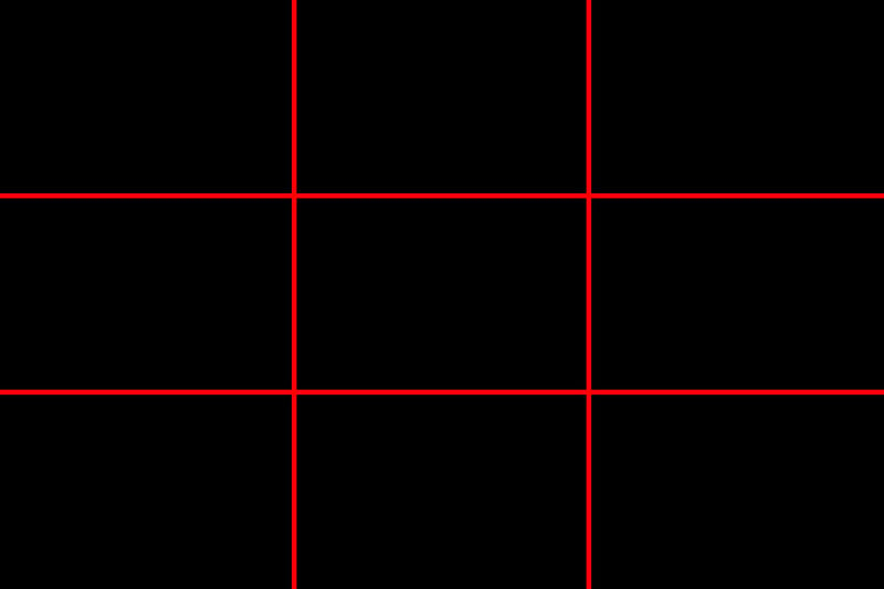
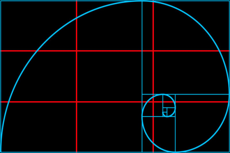
Just to slow things down a bit, here’s what the Rule Of Thirds (I’ll call it the ROT grid from now on) looks like on a plain black background. Chances are you’re familiar with it, you’ve seen it pop up on your camera’s viewfinder or as an overlay in Photoshop or Lightroom.
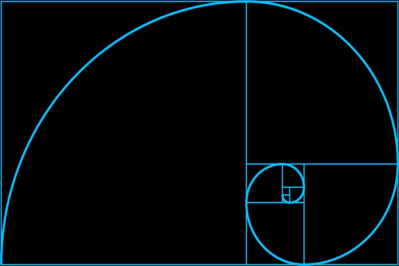
Here’s its superior, wiser, and elusive brother: the Golden Ratio, also sometimes called the Fibonacci Spiral. It is the result of when you do some complex maths on a rectangle to the tune of:
There’s no need to memorize this, you can find the overlays everywhere on the Internet to download and paste over your images, as well as being built-in (but very well hidden) in Lightroom.
Displaying the Golden Ratio in Lightroom
To access this spiral, press R to get your cropping function open, then cycle through the available overlays with O until you find the spiral. Turning it around is done by pressing Shift + O. There are eight variations to it.
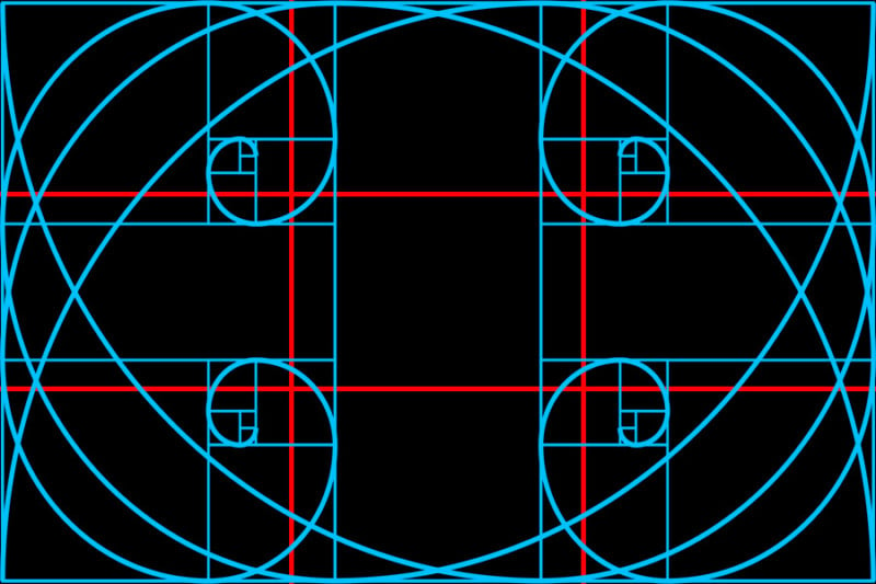
If I put the two overlays on top of each other, you can see how similarly they intersect. The tight spiral of the blue ratio almost marries up with the lower right intersection of the red overlay. There is a reason why the golden ratio gets oft pushed away — it’s because it’s murder to have all its eight variations displayed on a screen at once.
Why Use the Golden Spiral?
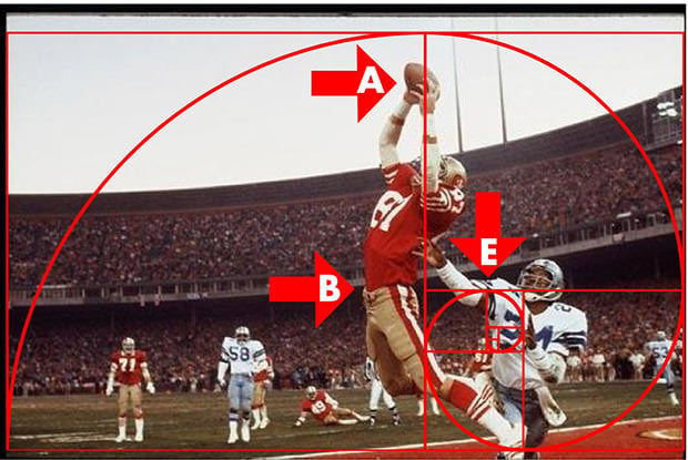
So if the golden ratio is more hassle than the ROT grid, why should I care about it? It all comes down to the long sweeping arc of the spiral. Putting your subjects along a curved line rather than straight grid lines draws the viewer’s eyes around the picture, forcing it to go closer to the tight coil of the spiral where you’ve placed your point of interest. It’s like a giant subliminal road sign pointing the eyes towards where you want them to go.
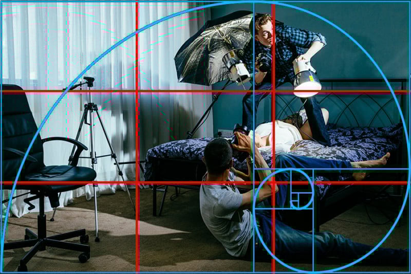
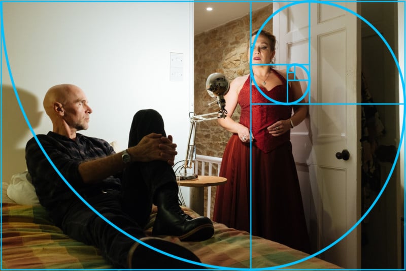
I hope I haven’t lost you yet. Here are a few real-world examples of the Golden Ratio in practice on a few of my images, one without an overlay and one with. Hopefully you can see how many times the images follow the sweeping curves and conclude with the focal point of the image in the tight coil.


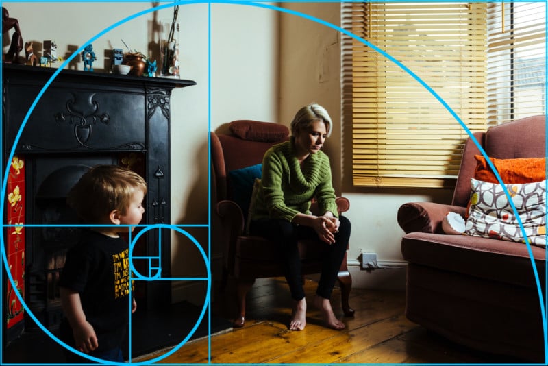

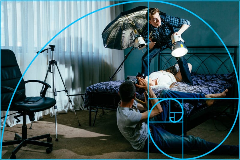

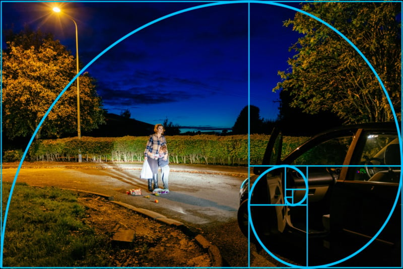
There are a whole host of different ways you can use the Golden Ratio — from portraits to landscapes… and even sports and street photography. Start looking out for the Golden Section when editing your pictures in your favorite cropping post-production program and see how it can take your pictures from “yeah” to “oh yeah!”
I have to admit, once I discovered my love for the Ratio, I started flicking back through the past few years of shoots to re-crop images in the Ratio. In my opinion, these newly-cropped pictures feel much more dynamic and interesting, and forcibly lead the eye around the pictures.
As always, it’s entirely up to you to take my advice, but I just want to be able to show that there’s more to the world of art than a criss-cross of lines. Let’s just call the Golden Ratio “The Rule Of Thirds, Plus Some More” (TROTPSM for short).
About the author: Jon Sparkman is a Cheltenham, UK-based fine art photographer. He centers his work around conveying a message through his photography. You can find his work at www.sparkman.photography and follow him on Instagram and Twitter.