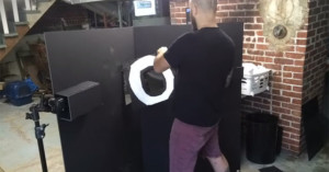
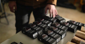
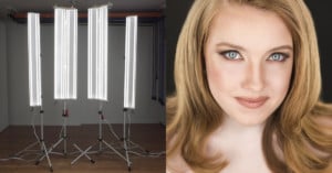
Posts Tagged ‘portrait’

Behind the Scenes of Annie Leibovitz Shooting Sean Connery for Louis Vuitton

Here’s an interesting peek at how Annie Leibovitz goes about shooting a portrait. This was for a Louis Vuitton advertisement a while back featuring Sean Connery.
Read more…

Study Finds That Kodak EasyShare and Camera Phones Make You Ugly

Study Finds That Kodak EasyShare and Camera Phones Make You Ugly PerformanceByCameraModelThere’s the old adage, it’s not the camera that makes the photographer, but according to a by-the-numbers study by dating site OkCupid, the nicer camera might make you look more attractive.

Based on a random “snap decision” survey hosted by the site (two juxtaposed photos with the question, “Who would you rather date?”), people tended to favor photos of people taken with Panasonic Micro-4/3s, followed by Leica point-and-shoots. DSLRs ranked pretty highly as well, followed by big-brand compacts. Certain camera phones like the iPhone ranked as slightly less, though still producing attractive photographs. Minolta DSLRs and the Nikon Coolpix fell below the attractive standard, along with most other camera phones. Kodak really takes it hard, ranking third lowest with the EasyShare next to the Windows and Motorola phones. Read more…

Macro Portraits of Emerging Mosquitoes

Brothers Will and Matt Burrard-Lucas, the same UK-based duo who created a remote-control BeetleCam to photograph wildlife in Africa, decided to get up-close and personal with some of nature’s less desirable creatures. The two originally noticed mosquito larvae in stagnant water sitting in the backyard of their home, and decided they’d found their next photo subjects. They patiently set up the photo shoot, waiting for key moment when the adult mosquitoes emerged from their larval state. It’s fascinating how delicate and alien the pesky critter is up-close:

Macro Portraits of Emerging Mosquitoes mosquito hatching

Their patience and planning went a long way, Will tells us:

We did a bit of research into their development and discovered that it takes about 1-2 weeks (depending on the temperature) for them to develop into the adult form. This gave us a good amount of time to devise a set up to photograph them as they emerged.

Over the course of about 14 days, we kept a keen eye on their development. We kept the larvae in a glass of distilled water indoors and covered it with perforated cling film – we didn’t want to suffer any bites during the night! Once the larvae had turned into pupae, we knew they were close to hatching. We soon discovered that when one straightened out, we had about 5 minutes until they hatched.

Read more…

Man Turns Photobooth Portrait into Mask

Man Turns Photobooth Portrait into Mask photoboothmask

If you use a Mac, you’ve probably taken strange photographs of yourself using the fun house distortion effects that come with Photobooth. Brookyn-based designer Mark Pernice decided to take one such photograph and turn it into a unique looking mask of his own face. Knowing the context, the mask is pretty funny and awesome. If I just randomly woke up in the middle of the night and saw this, however, it’d probably be one of the creepiest sights ever.

Photo Booth Mask (via PopPhoto)

PicTreat Provides Instant Face Retouching

PicTreat Provides Instant Face Retouching pictreatlogoPicTreat is a free online application that allows you to quickly and easily retouch portraits using patent-pending face detection and correction technology.

By “correction”, they mean the application can make your skin “smooth and shiny”, remove “irritating skin flaws”, fix red-eye, and correct color balance.

While we would prefer not to promote our culture’s obsession with outward appearance, we wanted to examine the technology behind this application.

Here’s an example of a before and after displayed on the front page:

PicTreat Provides Instant Face Retouching pictreatexample

To test exactly what the application does to a portrait, I decided to use the portrait of President Obama that I referred to recently. However, the app apparently couldn’t find any “blemishes”, and returned a nearly identical image — albeit with mildly smoother skin.

Thus, I decided to test how the service retouches a photograph by altering the photograph manually. Using Photoshop, I added some red-eye, added some spots to his face, and gave the photo a green tint. Here are the original, altered, and PicTreated images:

PicTreat Provides Instant Face Retouching pictreatobama

The app successfully corrected the artificial red-eye, restored the color to almost what it was originally, and left the random spots I added alone (which it should, lest it remove things like birthmarks).

In spite of the interesting technology behind PicTreat, many may find the app offensive due to the fact that it intentionally removes such things as freckles (a taboo among photo editors) and uses the slogan, “everybody’s perfect”.

What are your thoughts on this kind of service?


Image credit: Obama portrait by the Obama-Biden Transition Project

Photo Pulitzer Prize Winners: Mary Chind and Craig F. Walker

Photo Pulitzer Prize Winners: Mary Chind and Craig F. Walker mugsPhotojournalists Mary Chind of The Des Moines Register and Craig F. Walker of The Denver Post won Pulitzer Prizes this year in photography.

Chind’s photo of a harrowing water rescue photo won as the Best Breaking News Photograph. The photo, published July 1, 2009, shows a construction worker dangling above the rapids of a dam, in an attempt to reach a victim in the water. The Pulitzer board say the photo captured “a heart-stopping moment.”

The victim and her husband had gone over the edge of the dam on a boat. Rescuers could not reach the pair with a crane. According to the National Press Photographer Association, Chind took the photo from a nearby bank crowded with rescue workers and firefighters. A worker in a makeshift rig was lowered down towards the water and managed to save the woman after several attempts.

Photo Pulitzer Prize Winners: Mary Chind and Craig F. Walker rescue

Walker won the Best Feature Photography for his intimate photo essay of a teenager, Ian Fisher, as he entered the Army. Walker documented the young man for 27 months, following him as he recruited, trained, was deployed to Iraq, and finally returned.

The Pulitzer board described Walker’s work as “an intimate portrait of a teenager who joins the Army at the height of insurgent violence in Iraq, poignantly searching for meaning and manhood.” Color versions of Walker’s essay can be seen on the Pulitzer website and the multimedia package can be seen on the Post’s website.

Photo Pulitzer Prize Winners: Mary Chind and Craig F. Walker walker


Image Credits: River Rescue in Downtown Des Moines by Mary Chind and American Soldier by Craig F. Walker

Would You Like a Portrait with Your Burger?

Burger King recently partnered up with marketing agency Ogilvy for a unique “Have It Your Way” campaign. In order to convey how personalized the orders are, they used a hidden camera and printer to slap a candid photograph of the customer’s face right on the burger wrapper. A separate hidden camera was used to document the reactions of the customers after seeing themselves on their food.

Some customers pulled out cameras to remember the unique wrapper, while others stated they would save the wrapper itself. I found it pretty funny how unflattering the candid portraits were.

(via CNET)

Interview with Roger Hagadone

Even if you haven’t heard of Roger Hagadone, chances are you’ve seen his work before.

Hagadone is a talented commercial photographer whose impressive portfolio includes advertisements for the Blue Man Group and the cover of the popular young adult novel series, Twilight by Stephanie Meyer.


Interview with Roger Hagadone 11

PetaPixel: Can you tell us a little about your background, what you do, and where you’re based?

Roger Hagadone: I’m an advertising photographer, and I shoot editorial book covers and dabble in fine art. I’m based in New York City. I live here and have an office in LA where I work quite a bit as well. I moved to the City after college, and met several top photographers here, one including Annie Leibovitz, who became a big influence on how I shoot people.

PP: Where did you go to college at?

RH: Purchase college, just outside of New York City.Interview with Roger Hagadone hagadone portportrait

PP: When did you get started with photography?

RH: Professional commercial photography — probably 10 years ago now. I started with magazine editorial and eventually that turned into advertising.

PP: We notice from your portfolio that you’ve worked with a number of really interesting subjects. Do you have one particular portrait shoot that you find especially memorable?

RH: That would definitely have to be the shoot with Mike Rowe from Dirty Jobs. It was a lot of fun to work with Mike. He’s a really awesome guy. For that shoot especially, he was really a trooper. It was about eight hours of photography.

We covered him with special ‘dirty’ effects. We layered the dirt, starting out very light and added more as the day went on. At the end, he was completely covered.  A lot of people would be very cranky after that, but he was cool. He was having a laugh.

Interview with Roger Hagadone mike rowe hagadone

PP: How many people worked at the shoot?

RH: Around a dozen people including crew and client. There were three people just covering him with these different substances but in the end most of the crew pitched in. We covered him with grease and eggs, bubble gum, feathers, and all kinds of stuff.

PP: That alone sounds like a pretty dirty job.

RH: Yeah, actually he said that this may have been his dirtiest job ever. His only regret was that he didn’t have his crew there to film it.

Interview with Roger Hagadone mike rowe hagadone 21

PP: How would you describe your photography and style to someone who has never seen it?

RH: I would say it’s cheerful and sometimes surprising. Never boring — that’s the main thing, I can’t stand boring photography. I like to keep it positive and fun. There’s usually a narrative to the images, something of a story, or maybe a comment or a joke.

Interview with Roger Hagadone hagadone stereo

PP: Is there an example of an image that represents the general body of your work?

RH: That’s tough. One image that I like that comes to mind is the time bomb image. There’s a bomb squad guy defusing the bomb, and there’s his pal behind him, about to pop a bag to scare him. I just like that anticipation of the joke.

The visual effect in my images, the retouching and the lighting, are kind of two halves of the images that are both equally important to me. It’s not just the photograph and the concept, but it’s also the retouching aspect of it as well.

Interview with Roger Hagadone timebomb

PP: What’s the single item in your metaphorical camera bag, aside from your actual camera, that you can’t go without?

RH: It’s Photoshop, well Photoshop and a dozen strobes! I prefer to get as close to the final image in-camera as possible but it’s in post processing where my images come alive. I have several techniques that I use and they are constantly evolving.

PP: What do you shoot with, currently?

RH: I have different cameras. I shoot with a Hasselblad with a Phase One back, mostly for advertising shoots. Other than that, I use a 1Ds Mark III.

PP: What was your first camera that you ever got?

RH: I think that I was seven (years old) and I had a Kodak 35mm camera, which I still have.

PP: Is that when you started getting in photography?

RH: Yeah, I still have images from that, too.

The actual camera is in one of my photographs in my Bigfoot story. In one of the images, Bigfoot has a camera, and he’s taking a picture from behind bushes. That’s my first camera.

Interview with Roger Hagadone bigfoot hagadone

PP: So we discovered your work because you did the covers for Twilight, and that imagery is evoked in a lot of fashion, a lot of types of advertising nowadays, that uses a very similar color scheme: black, white, red. How did you conceptualize and visualize this?

RH: It’s really a collaborative process. It begins with the publisher and they have some concepts in mind. And then I interpret these concepts into photographs. Sometimes, they have a pretty good idea of what they’d like to see in the image. It could be a background, an object, and then it’s just the interpretation of that into a final image. When I shoot a cover for a book, I usually take the basic idea and shoot several different variations of that one concept.

Things change very quickly in the publishing world. Once I receive the assignment to photograph a cover, by the time it’s complete, things may have changed, and the images that I shot might end up on the cutting floor.

Or, I may be asked to re-shoot it with a slightly different idea. It’s a collaboration, and it’s important to be flexible.

When it came to the Twilight series, the first image of Twilight, the hand with the apple, set the tone for the rest of the images in the series: simple graphic composition. The use of red, white, and a warm black background. That pretty much set everything else.

Interview with Roger Hagadone twilight hagadone

PP: When you see this style used in other images, it’s as if it’s become a part of cultural memory and become almost iconic. How do you feel about that?

RH: It’s kind of huge that it’s crossed over into what I guess you would call pop-culture.

The first time I saw an advertisement similar to the look, I was taken back, but I wasn’t really sure if I was seeing it correctly, if they were really using inspiration from the cover in their advertisement.

But now, as you say it, I do see it quite often and it’s fun to see. Artists borrow from each other all the time, and I’ve been on both sides.

Other images that I’ve shot I’ve seen similar advertisements pop up six months later, but it’s give and take.

PP: Do you enjoy the attention you’ve received from your work on Twilight, or would you rather be known for your other work?

RH: I get a lot of inquiries about Twilight.

I don’t mind it at all, really. It’s kind of nice. The Twilight fans are really great. I get a lot of emails from them.

The weirdest thing that I’ve seen is the original Twilight cover — the hands and the apple — I saw someone with a tattoo of it. That was really bizarre, to see the photograph I shot tattooed on somebody’s arm.

That was shocking. It’s too bad I didn’t get a picture of that.

Interview with Roger Hagadone salvationmountain hagadone

PP: Let’s go back to you. What advice would you shoot to fellow photographers about interacting with their portrait subjects. From what your portfolio looks like, it seems like you’ve got a really good relationship with the people you shoot, or at least you know how to bring out their personality and emotion.

RH: The main thing is trust. They have to trust you. What I usually do is talk to the model before the shoot, before we start shooting to get that rapport going.

During the shoot, I keep it fun and fast-paced. Things are always moving, and I give them a lot of direction, so the model never gets bored or too distracted.

Also, I’m pretty silly when I photograph, so I think that element of fun brings out what I’d like. I also ask that from my crew, just to keep a really fun atmosphere.

Interview with Roger Hagadone hagadone bigfootjogging

PP: How long does it take you on average to do a photo shoot, for instance, the Bigfoot project?

RH: That one I shot in two days, and did all the post work within three days. So probably about a full week. They’re all different, though, depending on what’s involved.

A book cover may take one day to shoot and depending on retouching, it could take several days to finish up with revisions.

PP: And it gets bounced back and forth from you to the publishers too, right?

RH: Exactly. Like with the Twilight image, we got to the point where it was pretty much finished. And then there was a comment that the apple needed to be a little larger. So it was back to the drawing board, and we had tweak the apple just slightly.

Interview with Roger Hagadone hagadone cell

PP: How did you think of these image concepts for a lot of your personal work?

RH: Well, I’m an avid note taker. I just take tons and tons of notes.

The cliché is the pad by the bed, but I use an iPhone by the bed.

I use essentially a digital notebook and I just write all of my ideas in there. Sometimes it’s a full, complete idea that’s ready to go and I can shoot it; sometimes it’s just a little piece.

I’ll add little things to that piece later, but as soon as it’s ripe I can shoot it.


Image Credits: all images by Roger Hagadone

It’s All About the Eyes

Here’s an unprocessed portrait I took a couple days ago.

Its All About the Eyes pop1

Canon 40D + 16-35mm f/2.8 at 21mm. f/5.6, 1/125s and ISO 1600

I’m going to show you how I would go about post-processing this particular portrait of a child.

First, a little about the shot: it was taken at ISO 1600. Big mistake. I was constantly moving between indoors and outdoors, so dropping the ISO slipped my mind. If I had gone down to something like 800 or 400, I could have reduced a lot of noise and obtained stronger colors.

I was also being lazy and shooting in Program mode. If I had shot it wide open at f/2.8, the background could have been thrown out of focus more.

The sun was somewhere overhead behind the child, and there was a wall directly behind me, which was bouncing a good amount of light into his eyes. Eyes that lack any sparkle often appear dull, two-dimensional, and lifeless.

Anyhow, the portrait was very candid and wasn’t set up at all. Now, onto post-processing:

Its All About the Eyes pope1First, I open up the photograph in Adobe Camera Raw, and make the following adjustments:

White Balance: Upped the temperature from 4200 to 4700 to bring a little warmth back into the shot. The As Shot looked too cool.
Exposure: +50 to expose the shot a little more. If the background was completely blown out, I would have left this untouched to avoid too much clipping back there.
Recovery: +50 to recover many of the clipped areas in the background and a few areas in the foreground. (tip: toggle clipping indication with the U and O keys).
Fill Light: +10. This adds a little more “light” to the shadow areas of the shot, but also reduces contrast, since it turned many of the darkest areas into gray.
Blacks: +15 to set the darkest of the gray areas into true black, recovering a good amount of the black we lost through the Fill Light slider.
Brightness: Left unchanged.
Contrast: Upped this to +50 to make the photograph more contrasty. The original was pretty flat.
Clarity: +30. For photos with slightly blown out backgrounds like this one, I like to increase clarity a little to add a little more contrast to areas like the tree leaves.
Vibrance: Left untouched. After the previous steps, the photograph seemed saturated enough.

Also sharpened the photo a little and added some vignetting (about -50 for amount with midpoint at 25).

This is the resulting JPEG that Adobe Camera Raw spit out after making the above modifications (hover over it to compare it to the unprocessed version):

Its All About the Eyes pop2

Finally, I give the kid’s eyes a little boost in brightness. There’s lots of ways to go about doing this, but usually I like to use the masked curves adjustment layer technique I learned from David over at chromasia.

Here’s the resulting photo after I boost the eyes (hover over it to see what the eyes boost did):

Its All About the Eyes pop3

Pretty subtle, but a little extra glow in the eyes does help a lot. Hover over this link to see the mask that I used to apply a curve only to the eyes. You can also hover over this link to compare the final photograph with the original, unprocessed photo.

Friends on a Bench

One of the results of always carrying around my camera is that I end up with a lot of portraits of my friends. I had lunch with a few of my buddies last Sunday, and snapped this photograph while waiting for a friend:

Friends on a Bench IMG 2390

I was using a Canon 40D and Canon 16-35mm with the following settings:

Aperture: f/5.0
Shutter Speed: 1/100
Focal Length: 16mm
ISO: 800

Instead of using a higher focal length and backing away from my friends, I decided to go ultra-wide and move in close. This caused the closer friend (Joseph) to be much more prominent, even though they were both sitting close together. If I had used a longer focal length and backed up, my friends would have been more flattened out, and Joseph would have been featured less prominently in the photograph. Thus, going wide and moving in close to a particular person when taking a group photograph can really help to make a photo more dramatic.

Friends on a Bench shadowpositioning1As with most portrait shots, I focused on Joseph’s eyes before recomposing the shot. I also wanted to make sure that my main subject wasn’t directly in the middle of the frame, and that the two bodies subject balanced out.

I think if I had framed Joseph directly in the center, the fact that my other friend (Anna) was looking directly at the camera as well puts too much action on the left side of the frame, and too much empty space on the right side:

If there was only one friend in the shot, I would have pushed him more to the side, since there wouldn’t be another pair of eyes to work with.

I guess this breaks the rule of thirds if you consider both subjects as one entity, like in the silhouette to the left, but with the way this photograph was set up I think it worked to have the main subject closer to the middle and another subject a little to the side.

Another thing I chose to do was get down very low. Notice how they’re sitting on a pretty low bench, yet I’m still taking the photograph from below their eye level.

Now regarding post-processing, I first opened it up in Adobe Camera Raw and made the following edits:

Friends on a Bench fonbacrWhite Balance: Auto. It was decent and auto fixed it up by making it a tiny bit warmer.
Exposure: Left it unchanged.
Recovery: Anna’s white clothes were clipped in certain areas, so I upped recovery to get the detail in those areas back.
Fill Light: Added a splash of fill light to make the shadow areas a little less pronounced.
Blacks: Left this unchanged.
Brightness: Left this one unchanged as well.
Contrast: Increased to 60 to recover some of the contrast lost in previous steps, and to just increase it a little in general.
Clarity: Increased to 40 to bring out some detail in places like the bright clothes and the texture of the pillar.
Vibrance: Increased to make the colors pop a little more.

I also did the basic increase in sharpening, and added some vignetting to bring more attention to the subjects. These were all just pretty basic edits that I also step through when processing my RAW photographs.

Here’s how it turned out after modifications in Adobe Camera Raw (hover over it to compare to the unedited version):

Friends on a Bench IMG 2390b

This is where I would normally be done with an image like this. However, suppose I wish I had used a wider aperture to have a shallower depth of field (i.e. if I had used f/2.8 rather than f/5.0). Obviously I can’t go back and reshoot, but what I can do is fake the depth of field in Photoshop. I might go into more detail into how to do this sometime in the future, but I’ll just briefly describe it now.

First, I duplicate the layer to make a blur layer. I use Filter->Blur->Lens Blur for the blur. Then I use the following mask on this blur layer to selectively choose where to add blur and where not to (hover over it to see the blur layer. Might take a few seconds to load):

Friends on a Bench mask

Here’s the resulting image with the fake depth of field added (hover over it to compare it to the unedited photo. Hover over this link to compare to the non-blurred version.):

Friends on a Bench IMG 2390c

I hope this was an interesting and informative walkthrough. Leave a comment if you have any questions, suggestions, or tips!