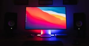
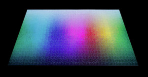
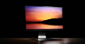
From time to time I post plots of color gamuts like the one above. Each time, I get emails asking how I make them, leading me to assume that the world’s thirst for color nerdiness is going unquenched. I’m setting out to fix that in this post. Read more…
Los Angeles-based photographer Brice Bischoff has a project titled Bronson Caves. Between 2009 and 2010, Bischoff visited the caves in Los Angeles’ Griffith Park with his 4×5 large format camera and some very large sheets of colored paper. He then used long exposure times to paint colorful blurs into the photographs by waving the papers around. Read more…
Photographer Philippe Echaroux tells us that he recently completed a photo shoot for a series he calls, “The Pigment Party”. Echaroux’s idea was to capture studio-lit portraits of models posing serenely amidst explosions of colorful powders. After covering the studio with tarps, hanging up a black backdrop, and setting up his lighting, Echaroux had his assistants toss pigment powders of various colors onto the model’s face.
The behind-the-scenes video above offers a look at how it all went down. Read more…
Last week we shared a project by photographer Tyler Casson that featured four photos of an island across four seasons of a year. Photographer Kevin Day has been doing a similar project — one that he has been working on for over five years now. The Berkshire, UK-based photographer has been visiting and documenting one particular tree in a field, snapping photos showing different seasons and different lighting conditions. Read more…
The amount of dedication required for the time-lapse video above is astounding. Titled “Fall,” it shows the colors of New York City’s Central Park changing with the seasons over a period of half a year. Here’s what its creator, photographer Jamie Scott, says about it:
One of the most striking things about New York City is the fall colors and there’s no better place to view this then Central Park. I chose 15 locations in the park and revisited them 2 days a week for six months, recording all camera positions and lens information to create consistency in the images. All shots were taken just after sunrise.
Unless you only shoot in monochrome, color likely plays a huge part in the experience of viewing your photographs. You may be aware of how you use them, but do you know how the colors in your images affect the people that look at them? PBS Off Book put out this fascinating video today that explores just how powerful colors are. Read more…
Is your browser color managed? If not, the photographs you are looking at are distorted versions of what their creators intended them to be. Is the car above rendered in school bus yellow, or in a jarring purple? Read more…
The Impossible Project has partnered up with Japanese music producer and designer Nigo for a limited edition version of its PX 70 Color Shade Film. Instead of its traditional white frames or the newer black frames, the film comes in 10 different colors: yellow, orange, red, pink, lilac, dark blue, light blue, green, black and white. Each pack comes with eight frames with randomly selected colors and costs $25 over at The Impossible Project shop.
“Mimicry” is a photo project by Dutch photographers Ilse Leenders and Maurits Gisen that’s based around the idea of uniformity. They write,
The inspiration of the series Mimicry came from the uniformity of the human beings. People from whom the identity is missing and those who are inconspicuous in our society. Just like animals they adapt to their environment. Visually in this series it is shown by the use of similar costumes, position and sex.
The Pink & Blue Project by South Korean photographer JeongMee Yoon started seven years ago after she photographed a portrait of her 5-year-old daughter sitting next to her beloved pink possessions. She then began creating portraits of other girls who loved pink things, and then other boys who loved blue. Read more…