Low Contrast Photography and How to Correct it in Post-Processing
One of the most asked questions I get is how I add contrast to pictures taken in very low contrast conditions like dense fog. This made me think it would perhaps be of use to many of you if I wrote an article about contrast and how you can fix contrast issues in post processing.
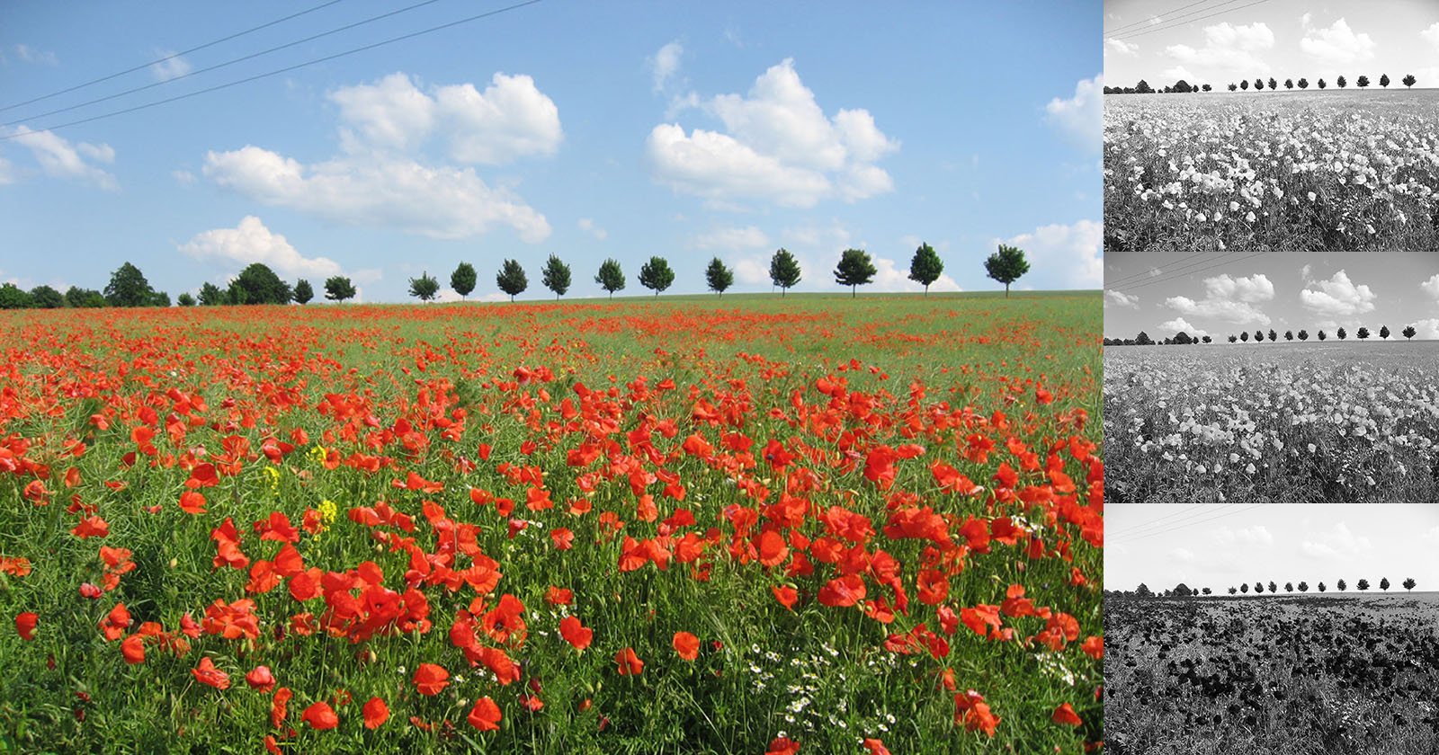
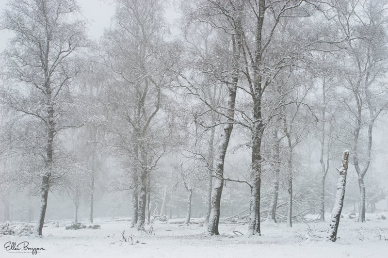
As I was out taking pictures in a winter landscape covered in dense fog recently, I realized that all my pictures would either have high contrast when the fog would lift a bit or extremely low contrast if I were to use my telelens compressing the dense fog even more. What I mean by this is that in the snowy foggy landscape, trees can quickly turn into black silhouettes against white backgrounds, causing a high contrast with lots of blacks and whites. In the other example, the shapes would be barely recognizable against the background and would fade away. As the bright white of the snow reflects a lot of light, the fog was also close to white and properly exposed this results in a histogram with lots and lots of highlights and whites but hardly any shadows and blacks.
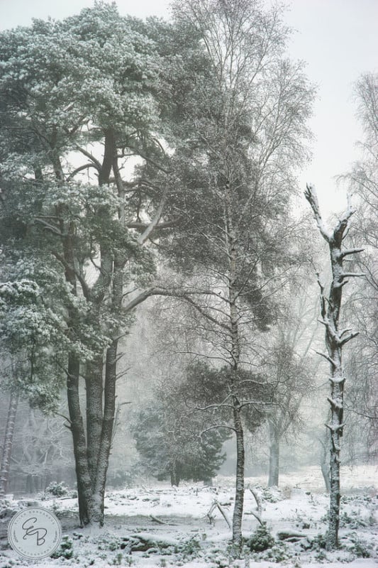
It is the difference between the dark and the light values that makes you perceive an object. If you have ever got lost in the fog, you know that this is because you can’t make out the familiar shapes and locations anymore, because the fog wipes it out. Very low contrast makes contours extremely vague and objects harder to recognize.
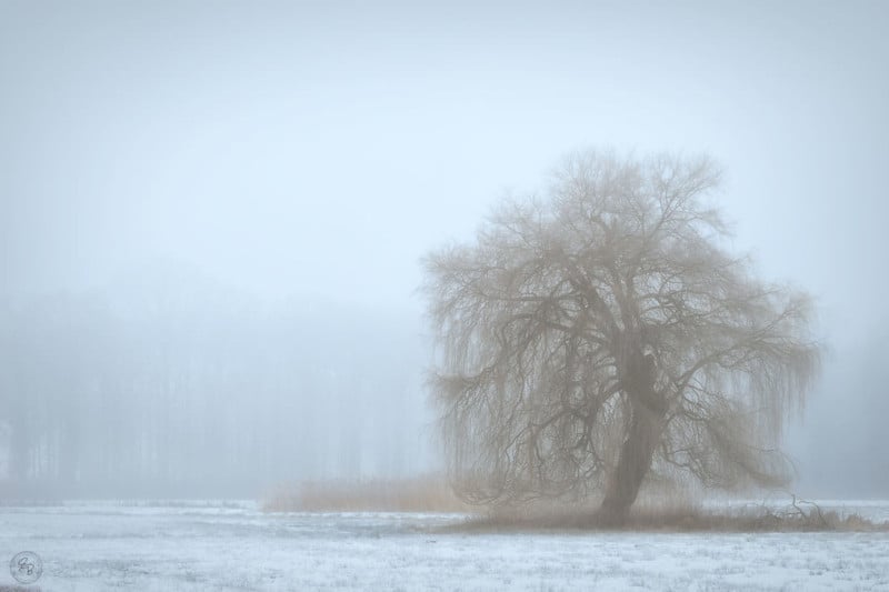
In foggy conditions, color contrast is also really low. Colour contrast is all about colors that are opposite each other on the color wheel, like blues and yellows, reds and cyans and green and magenta. This contrast can be explained best by saying that these colors make each other pop, while colors that are close to each other on the color wheel will give a more tranquil and lightly more muted feeling even if these colors are themselves primary and expressive colors.
Fog creates a layer of grey over the colors making them look muted and dusty. In the case of fog in a landscape with snow, the snow will reflect so much light, that the mist will turn very bright as well and this will then create an almost white veil over the colors.
The best way of explaining what happens to colors in the mist is by simply thinking what would happen if you were to add grey paint to color or in the case of bright fog: what would happen if you added very pale grey paint to a color? The denser the fog is and the lighter the color, the more muted and paler the colors will look.
Another thing to remember is that we also see depth because of contrast differences. I always think this is easiest to explain by letting you imagine looking at a landscape with mountains. The further back the mountains are, the less contrast they will have. This is because you are essentially looking through an atmospheric haze and there is more haze to see through for objects in the distance than in the foreground. This then gives us a clue that these hazier subjects are further back. The haze also makes the subjects in the distance appear more blueish in tone than the ones that are closer to you.
Contrast is what is needed for your camera or lens to perform its autofocus tricks. If there is hardly any contrast, it will be extremely hard for a lens to lock focus. This means that in these kinds of conditions, you’ll have to rely on manual focusing. It is true however that a lens will perform better in bright low contrast conditions than in dark low contrast situations. In case of very gloomy foggy days, it is very hard to get a lens or camera to use autofocus and if it does manage to lock focus, you’d better make very sure it did focus correctly because it is often a hit-or-miss situation.
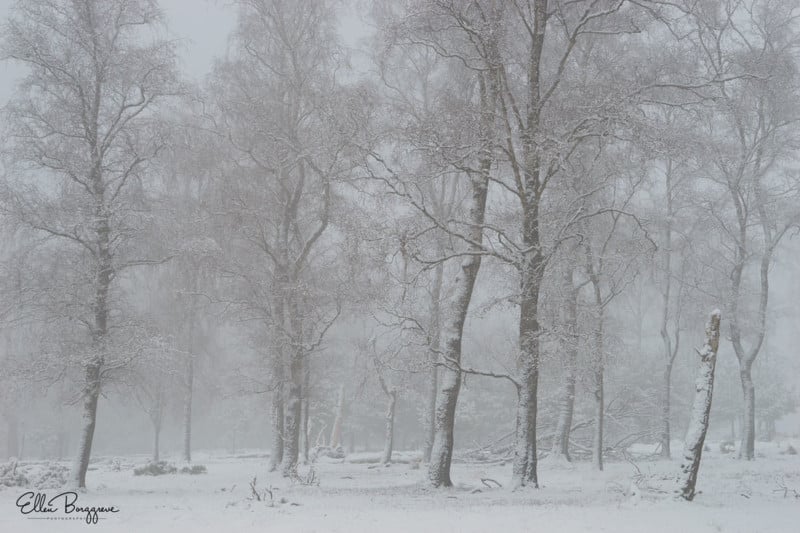
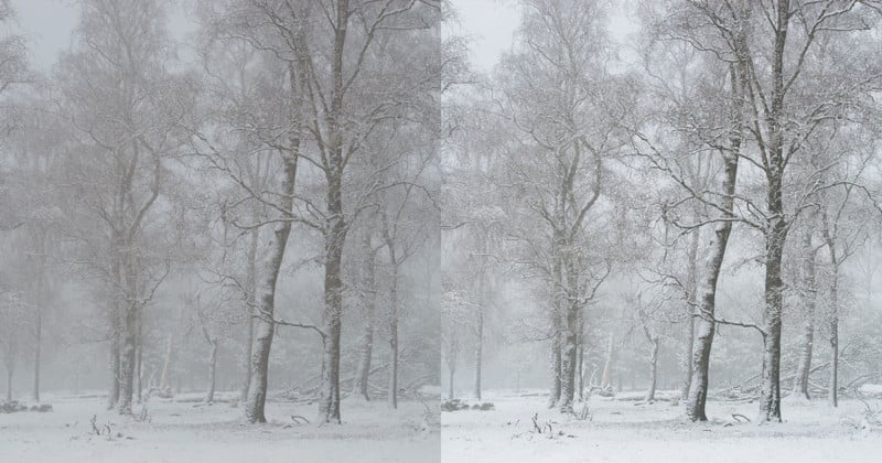
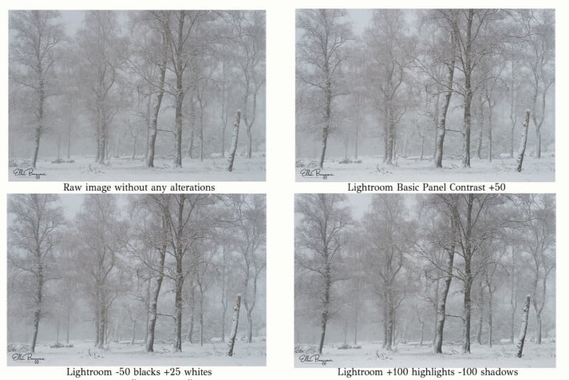
Pictures taken in foggy conditions can come out looking incredibly flat as RAW files and something needs to be done to the contrast. There are so many things that affect the contrast, though, and I will show you the difference between the many methods of adding contrast and the possible downsides of specific methods. The picture above is an unedited RAW file with low contrast.
There are many ways to fix this and some of the most obvious ones might actually not be the right choice. Let’s start in Lightroom. There are quite a few ways to add contrast in Lightroom CC and the most obvious one is using the contrast slider (which I actually hardly ever use). You can also add contrast by adding whites and blacks to the image or to make the highlights brighter and the shadows darker. Just for comparison’s purposes, I put them together in a grid for you. Obviously, these are not values that I would use, but they do give an idea of what will happen.
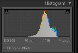
Here is the original histogram of the raw file (shown above):
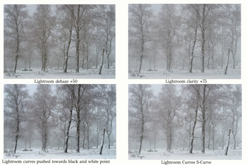
Another very obvious choice is to use Dehaze. I have a problem with the Dehaze option of Lightroom for several reasons. This option was originally meant to cut through the atmospheric haze that I just talked about in the example of the mountain view. The further away the mountains are, the hazier and more blueish they will look, and Dehaze corrects this. This means… that it also corrects the color cast, which is why it is not great for adding contrast to pictures taken in dense fog. Look at the example below and you’ll see what this option did to the original RAW file. It added quite a lot of warmth to it and there are now differences in color cast in the image.
There is another reason I really dislike Dehaze and this is because I have noticed it tends to cause color banding, even in 16-bit files. This is something that is very hard to get rid of and it can lead to severe color banding in skies, but also in even colored foggy areas. This is why I steer clear from using Dehaze in Lightroom and I would typically stick to the blacks and whites method as I show in the grid above.
Clarity adds local contrast in the midtones only. This means that it has a different effect than the Contrast slider, which also affects the highlights. Clarity will typically render an image darker than contrast would, but it makes details sharper and more defined. It is very suitable for bringing out details.
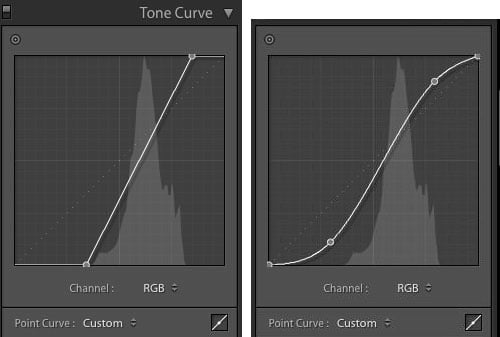
The next option is to use curves in Lightroom. We can opt to bring the black point and the white point in, which has a terrible effect as you can see, but you do not want to have true blacks and whites in a foggy image, so you would not take the curves’ black and white points to the extremes. The other option is to create a slight S-curve, which darkens the shadows slightly and brightens the highlights, which is a method I often use.
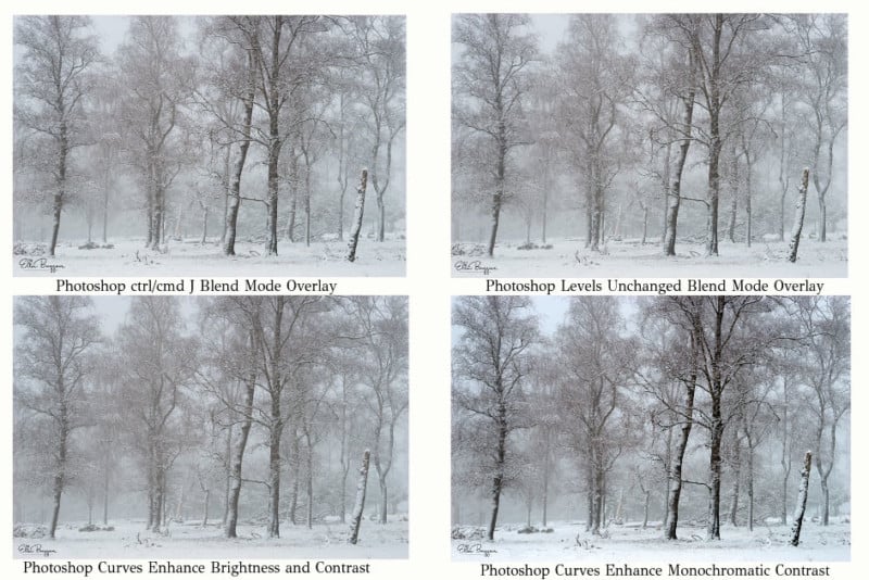
We can also add contrast in Photoshop. There are so many ways to do this that I could write many articles about it, but I will stick to explaining some methods that you might not have considered. The first method is to duplicate your layer and switch the blend mode to a contrast blend mode like Overlay. All the blend modes in the sub panel with overlay mentioned on top are essentially contrast blend modes and some are very extreme.
Now that you have changed the blend mode, there is more contrast, but you have also hugely increased your file size and this is why I do this differently. I add a levels or curves adjustment layer without making any alterations and then put the blend mode on overlay again. It has the exact same result, but without the disadvantage of a larger file.
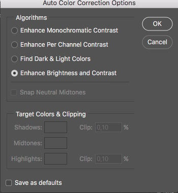
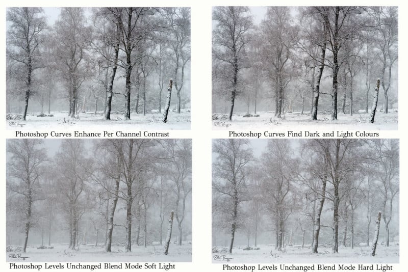
Next up is the wonderful curves adjustment layer in Photoshop which has some hidden options. Add a curves adjustment layer and alt or option click on “auto” which will give you four options to choose from. The dialogue box will look like this and some of these contrast options are really useful. I often use the Enhance Brightness and Contrast, of which I usually take down the intensity.
I also often use the option to add a levels or curves adjustment layer without any alterations made and switch the blend mode to soft light, which works in a more subtle way than the Overlay or Hard Light blend mode as you can see…
By the way…if you make an S curve in Photoshop and you find it affects the colors in your image too much, change the blend mode to Luminosity. That way the change you made does not affect the colors.
With all this explained, here is my preferred way of adding contrast at the moment. I have been working with Luminar for quite some time now and recently switched to Luminar 3 and use the filters Accent All, the black and white sliders and make a slight S curve in Curves. I find that Luminar 3 speeds up my workflow tremendously which is precisely why I love it so much and this method is not messing with the colors in the image either.
As with so many things in art and photography, contrast is, of course, a matter of personal taste as well. If you, however, take the effort to capture images in low contrast conditions, don’t spoil it by adding a ton of contrast, it will definitely affect the mood of the image.
Also… if you take pictures in high contrast conditions, don’t expect that you can change them into moody foggy pictures in Photoshop. This is just not going to happen. You can do a lot of things in Photoshop, but to add fog like you would see it in nature is quite impossible. I get this question all the time: “How do you make this fog in Photoshop?” My reply is always that no one makes fog like nature and this is what I work with.
I hope this article helped you a bit to make an educated decision about what sort of contrast you want to add.
About the author: Ellen Borggreve is a Dutch fine art landscape photographer who mainly focuses on misty landscapes and woodlands. The opinions expressed in this article are solely those of the author. You can find more of Borggreve’s work on her website, Facebook, and Instagram. This article was also published here.