Comparing a VSCO Film Emulation to the Actual Film
I’ve been a user of VSCO Film for Lightroom for several years now. I’ve been happy with the results, but I wanted to see how close VSCO’s settings are to actual film, so I decided to do my own tests.
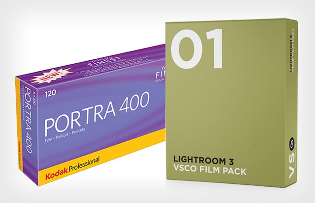
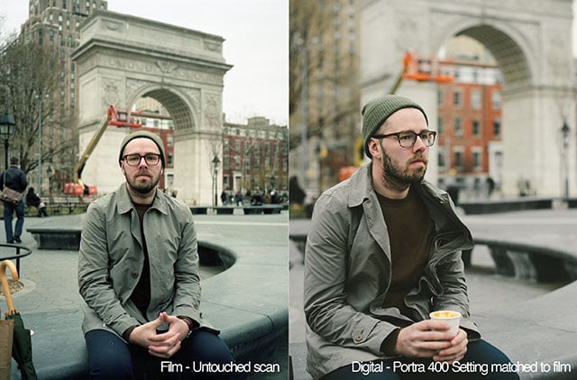
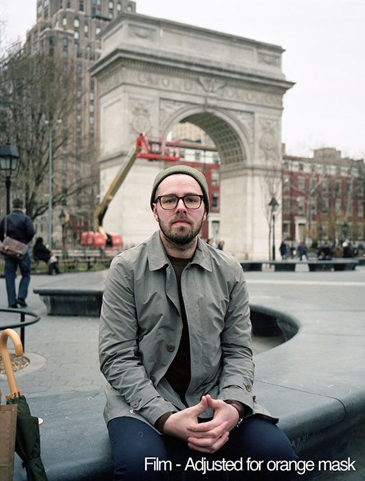
This whole experiment was a learning experience for me, especially regarding the digitization of a film negative. For this casual experiment I shot some Portra 400 film on my medium format Fuji GA645, snapped a few similar frames on my Nikon Df, and did a side by side with the VSCO Portra 400 setting from Pack 01 straight out of Lightroom.
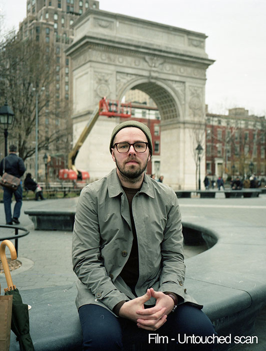
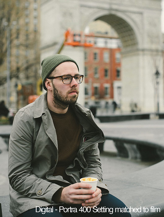
And a closer look:
The Portra setting needed quite a bit of tweaking to look like the film I shot… or so I thought. There are so many variables — lighting, white balance, focal length, aperture, and medium format versus full frame — that all make the image what it is. The majority opinion was that there was too much of a green cast on my scans, and I had already taken the time to match my digital image to that green cast.
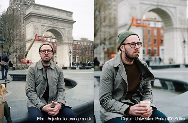
After posting to the r/photography board on Reddit, I was quickly informed that I’m not adjusting for the orange mask present on Portra film on my scans. Being relatively new to film, I thought that all I had to do was put my negatives in the scanner, press scan, and be done with it.
I also learned that each film scanner will impart it’s own bias on the scan, some of these biases should be corrected. The “ethical” argument of how much film should be digitally post-processed came to mind, as well as the want to maintain as much of the character that the film stock has. To me, if I’m shooting film, going out and getting it developed, picking it up, then scanning it only to drastically tweak colors, why not shoot digital?
I went back to my film scan, moved the tint slider a bit towards the magenta side, and immediately the scan looked a lot more like VSCO’s Portra 400 setting applied to my RAW digital image. Some of the colors are slightly off, but overall, It’s pretty close.
A closer look:

This was a fun experiment that ended up teaching me a fair amount of the scanning of negatives. VSCO’s Portra 400 setting ended up being really close in tone and overall look to the film stock that I shot. This exercise forced me to do some more research on scanning film, and will no doubt help out down the line.
While most of my work will continue to be on digital, film is definitely fun to shoot. It’s nice to slow down, get the settings right, and think carefully before hitting the shutter button.
About the author: Ed Jelley is a Long Island-based photographer who specializes in product photography and portraits. You can find his work on his website and Instagram.