Recreating the Look of Tintype Photography Using Photoshop
The other night I came across the work of photographer Victoria Will, who made real tintype portraits of some actors who attended this year’s Sundance Film Festival.
The portraits themselves were excellent but what really drew me in was the effect of the tintype medium and the old lens and camera that was used to make the images; very narrow depth of field, low tonal range, and non-uniform exposure across the frame. I decided I wanted to see if I could replicate the look of tintype using my Sony A7R and some Photoshop massaging.
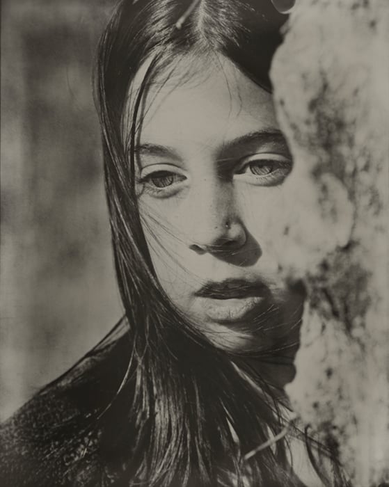
Next, I evaluated the image exposure as a whole: Highlights appear to struggle with separation from mid-tones. Of course, blowing out a highlight that only measures 164 out of 255 possible values makes it look as though it’s just a creamy upper-side of mid-tone, especially with the near-skin-tone coloration of the medium.
The darkest blacks I could find had an RGB value of around 24,22,18, respectively. This leans the blacks to a very dark gray with just a hint of orange. Most of the shadows measured in the 40s to 50s. Since the highlights are not very bright and the blacks aren’t very black, the image has about 56% of the tonal range of a typical black and white image (on screen of course).
With all of that said, I’d like to share with you what I did on my first attempt at simulating a tintype.
Step 1
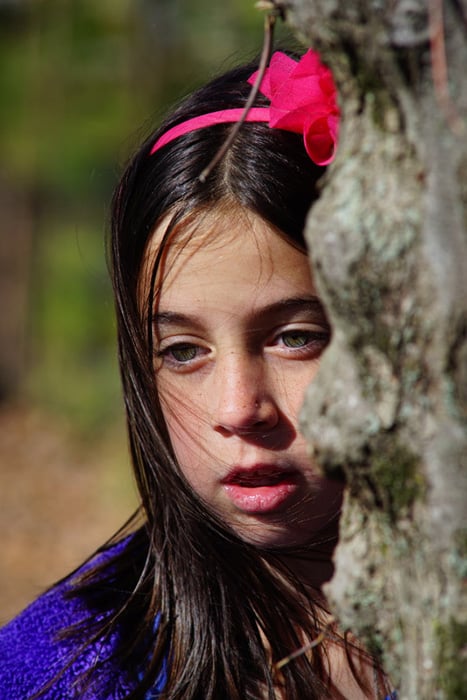
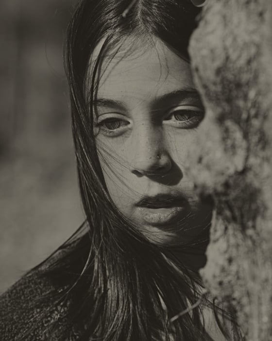
Shoot a portrait using a large-aperture lens set to its widest setting. In my case, I used a Minolta 100mm f/2.8 lens. For lighting, I used a fairly low-in-the-sky sun to light my subject (one of my daughters). This gave me directional lighting for good contrast and shadows, giving the image good dimensional quality. Here’s my straight out of camera source image:
Step 2
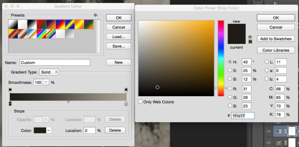
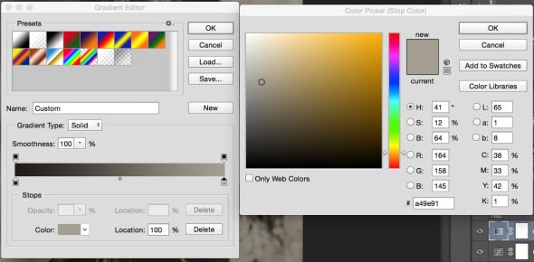
After importing the photo to my computer, I loaded it up in Photoshop. Using a Gradient Map adjustment layer, I set the black and white point and coloration:
Here is the effect of the Gradient Map:
Step 3
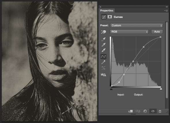
Now that we’ve redefined the black and white points and coloration, we need to work on that mid-tone contrast. Create a Curves adjustment layer beneath your Gradient Map. This is important as you don’t want the effect of your Curves adjustments to extend your tones outside the confines we set in the Gradient Map. The edits made to your curve will be unique to your photo.
Your goal should be to try to compress the mid-tones to get a decent contrast while not getting so blocked up that your shadows and highlights lose all detail. This is one of those things you have to simply fiddle with until it looks right to you. Use a real tintype as a reference.
Step 4
By this point, the image is starting to mimic the look of a tintype. I wasn’t quite satisfied with how clean the image still looked. It still looked like a modern photo. I wanted to create some overlain imperfections and character – a little brightness and darkness here and there.
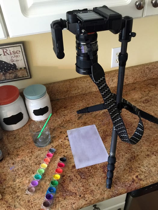
To do this, I soaked a piece of printer paper in water and used watercolor paints to give it some character. After I had gotten what I felt would work well in Photoshop, I set my camera up on a tripod and photographed it. I shot the image with a Rokkor-X 35-70mm f/3.5 set to it’s macro focal length of 70mm with an aperture of f/5.6 and ISO 100. A flash can be seen on my camera but I did not use it.
The kitchen wasn’t very bright so this gave me a fairly slow shutter speed. Taking advantage of this, I used my Vaping rig to generate some clouds which I blew across the paper while the shutter was open. This effectively softened up the image in places.
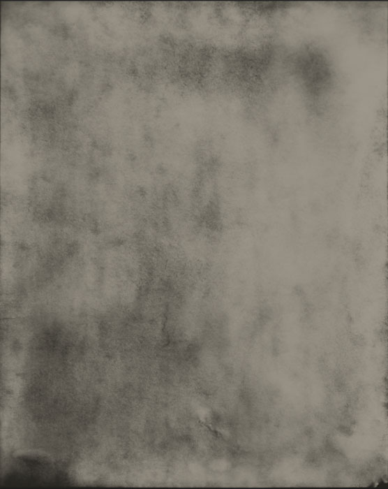
Here is the result:
Step 5
After importing this photo of the paper on my computer, I used Photoshop’s ‘Place Embedded’ function in the ‘File’ menu to bring it into my portrait photo. I moved this layer on top of my Background image, beneath my Gradient Map and Curves adjustment layer, and set the Blend Mode to Soft Light. The Soft Light blend mode will make this Paper layer transparent, using it to darken and lighten the Background layer according to the dark and light values in it.
This proved to be very effective in changing the look of the photo. The only criticism I have for myself on this is that while it did create some spot randomness to the exposure, it gave the image a paper-looking grain that you would absolutely not see in a tintype. Given the time, I would like to attack a sheet of copper with some salts and acids to create a new and more realistic source for an overlay.
Step 6
This final step is simple. In Photoshop, press Shift+Command+N (Windows = Shift+Control+N). This pops up a window for creating a new layer. In this window you have the option to change its Blend Mode. Change it to Soft Light. An extra option is now available at the bottom of the window to ‘Fill with Soft-Light-neutral color (50% gray). Check that box and press ok. Drag this new layer to the top of your layer stack.
With this new layer selected, select the paint brush tool. Press ‘D’ on your keyboard to default your color palette to black and white. You can press ‘X’ to switch back and forth between black and white. Using your paintbrush, you can now lighten and darken your image by hand. Black, painted onto that new layer, will darken and white will lighten. I like to use a brush opacity of ~ 20% and a fill of between 5 and 10%. I used this layer to brush in some light leaks (white) around the border. I used black to darken up a few areas just to balance things out some.
One of these days, I’d love to pick up an old box camera and give the real thing a go. There are plenty of resources on the web for preparing and shooting tintypes. When it comes to making art, newer isn’t always better. Technology will continue to progress cameras into new realms of image quality but old techniques like this will never be forgotten.
About the author: Tom Leonard is a photographer who travels the world 30 days at a time. He shares photographs from his journeys over on his website Out for 30. This article originally appeared here.