BTS: Using Forced Perspective Drawing and Light Painting to Create a Mind-Bending Adobe Logo
![]()
For the Adobe Remix project, talented light painting artist Janne Parviainen painstakingly combined forced perspective drawing with light painting to create something really special.
He then lit these drawings and the logo to bring them to life using long exposure. Here’s a video overview of both version 1 and version 2, followed by detailed BTS shots of the whole process:
Version 1
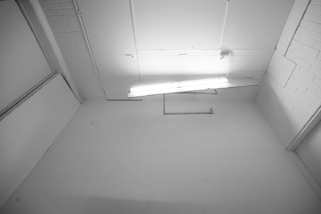
First, Parviainen transformed his studio from this:
Into the blank canvas he needed:
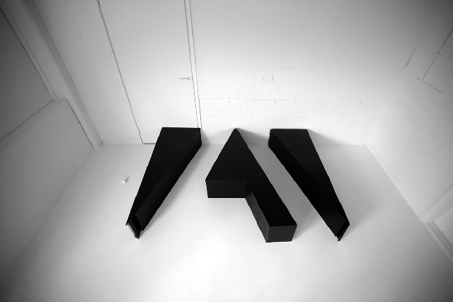
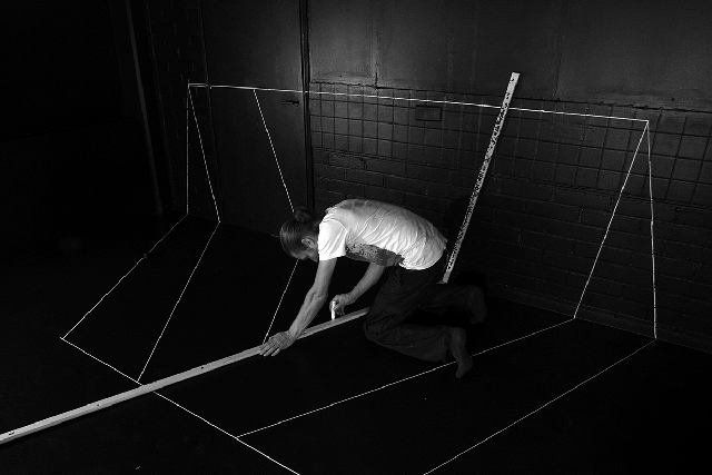
Next, he used a plywood version of the Adobe logo he built himself to see how it would interact with the surroundings and his drawings:
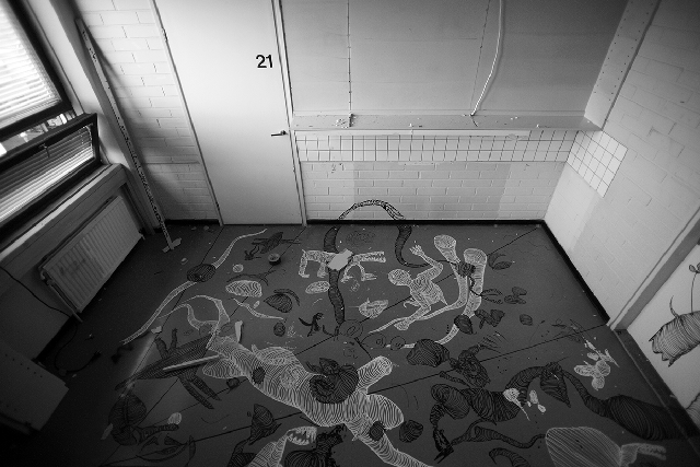
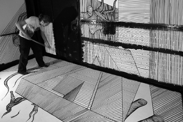
Then came the drawing, both of the logo and the characters. “As you can see from the finished drawing some of the lines go through even four times a 90 degrees angle change,” he writes on Behance, “and had to be drawn so that the line still looks straight to the main camera’s angle.”
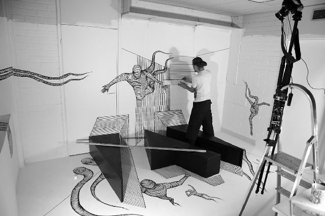
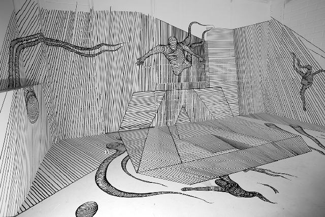
Clearly in that, he succeeded:
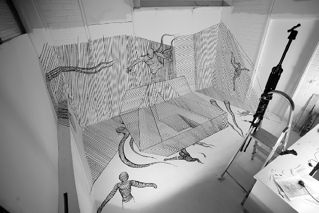
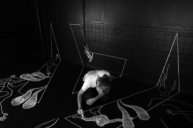
Finally, once everything was drawn and ready, Parviainen got to light painting. He explains how it came together:
I drew the light characters by tracing my body in right positions with a small white led by using long exposure on my camera in a completely dark studio. The forced perspective drawing was then carefully lit with a very dim flashlight from a close distance in order to highlight just the right areas of the drawing.
![]()
Version 2
The second version required that he paint over the last and turn his studio from a blank white canvas into a blank black one:
Next, he had to draw the logo upside down, making the forced perspective aspect all the more difficult. He did this because he wanted the final light paintings to look like they were flying over the logo.
It’s nearly impossible to tell if you’re not looking for it, but the final drawing from the proper camera angle is actually cut in the middle of the Adobe logo by the seam between floor and wall:
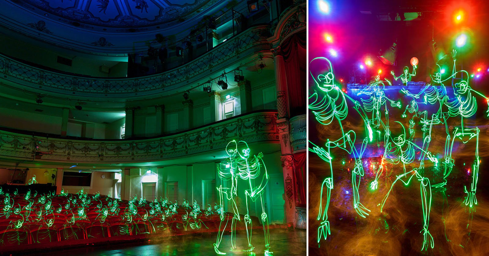
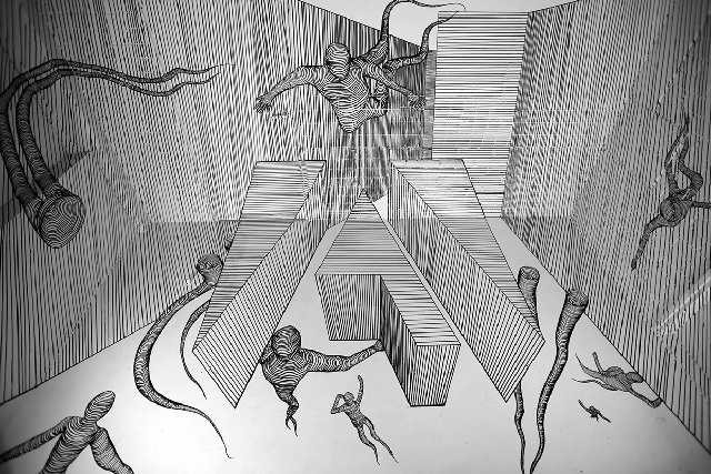
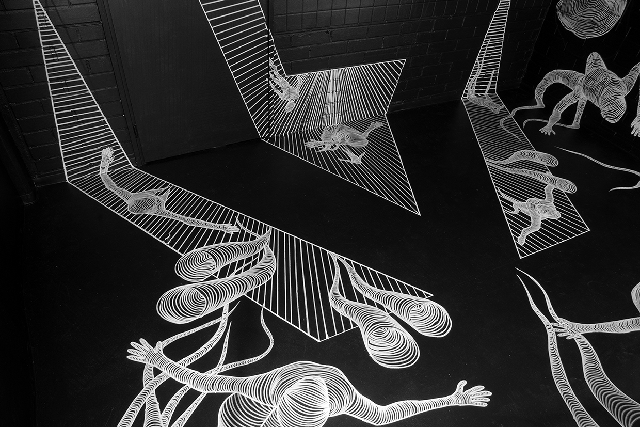
Finally, the finished photos with light painting added. “The white permanent marker drawings were lit with a small flashlight in a darkened studio while the camera was shooting on long exposure,” explains Parviainen.
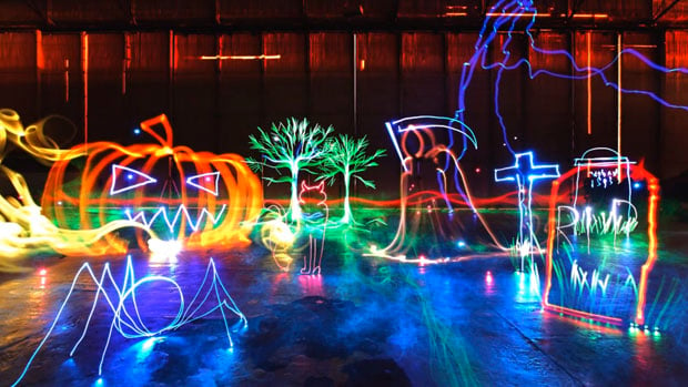
![]()
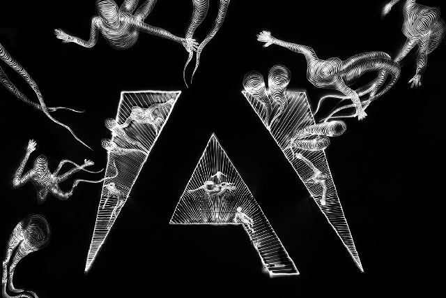
The black and white photo was shot in black and white, using a green LED, “in order to get more nuances for the light trails.” The green and colored photos below were shot in color using green and RGB LEDs, respectively.
In the second photos, the lines in the drawing were each individually traced using the RGB LED in order to capture smooth color changes. Truly an impressive feat of both art and light painting:
![]()
![]()
To see all of these images in higher resolution, check out the full album on Behance. And if you’d like to follow more of Parviainen’s work, be sure to visit his website by clicking here.
(H/T ISO 1200)
Image credits: Photographs by Janne Parviainen